0 members and 640 guests
No Members online

» Site Navigation

» Stats
Members: 35,442
Threads: 103,075
Posts: 826,688
Top Poster: cc.RadillacVIII (7,429)
|
-
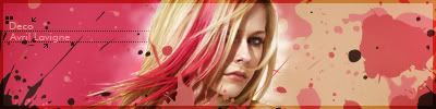
 Worst Stock Sig Worst Stock Sig
Gah the stock was so bad that i was confused what to make of it. The fucking guy who requestied the sig gave me this stock. and i couldnt make much better than this one. cnc is it good try?
Stock damn it was so blurry and distorted) damn it was so blurry and distorted)
The Sig:

A tip on what should i improve wil be the best thing .
Oh just edited with some gradients

Last edited by KidBuu; 01-18-2009 at 01:21 AM.
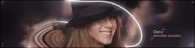
Fur's Gift BOOOO EVERYONE

-
I have to be honest here and say it's not all that great. I know you can do better.
It's SO bright, has a lot of contrast, has like anti-depth, and the text is just godawful.
Some good things though: basis for a lot of cool effects, great blending in there, and nice color scheme and compo.
I'd suggest first checking for some stock sig tuts. For this sig though try and first go back and remove whatever gradient maps/curve settings that you have that are adding so much contrast.
Second, darken it / clearly define some of your effects with some gradient maps.
For god's sake change the text.
Maybe some smudging, I generally smudge the bg in stock sigs.
Add some depth, use curves that don't add contrast, and primarily the burn and dodge tools, very very useful.
OOOHHH and the border needs work. try just using cinematic borders or side border things, but not both or a combination of either.. and generally black is a nice color for borders.
EDIT ON THE SECOND ONE:
WOW, EVEN MORE CONTRAST.
Darker, so a bit easier on the eyes.
color scheme is just as nice now too
text is still ugly
border
contrast out the wazoo...
(refer to above c&c)
Last edited by Miril; 01-18-2009 at 01:25 AM.

Et Tu?
SilentShadow | Jorrne | Arcmenis | Garis | Splinter | Sanbu | DeadlesS | Tekken | Proflax | Suddu
-
-
Get a better render. 
Not much you could have done with that stock, its not a great one.
The sig is a bit too bright, the colours look way over exposed.
Light source is cool, some good flow that is broken up by that blue glow line things at the bottom.
Text is a bit too much, it's too noticeable and too many different fonts.
Good try, it's not bad, considering the stock was horrible.
 Originally Posted by MarkPancake

MarkPancake banned.
Success.
-
Similar Threads
-
By Criss in forum The Void
Replies: 30
Last Post: 05-08-2007, 10:15 PM
-
Replies: 20
Last Post: 03-01-2006, 05:23 PM
-
By K a 0 s in forum The Void
Replies: 38
Last Post: 02-16-2006, 11:33 PM
-
By Jelan in forum The Void
Replies: 32
Last Post: 06-21-2005, 02:20 PM
-
By .exploited in forum The Void
Replies: 22
Last Post: 06-11-2005, 08:44 PM
 Posting Permissions
- You may not post new threads
- You may not post replies
- You may not post attachments
- You may not edit your posts
-
Forum Rules
|


 Reply With Quote