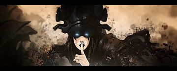
I disagree, i dont think the flow is that bad in this one, and as i said before flow isnt always what makes a great sig. I think its pretty awesome for a first go, sure you didn't use a tutorial ? how did you learn the clipping mask effects then ? still a decent looking sig, i would still remove a bit of the clipping mask from hulks face and then add some depth, do this by making a new layer apply image and then gaussian blur it like 0,5 px erase over focal and also a bit over clipping masks, if its to blurred lower opacity. then hide this make a new layer apply again and then use sharpen>sharpen or unsharp mask. erase all but not on focal point


 Reply With Quote