0 members and 26,370 guests
No Members online

» Site Navigation

» Stats
Members: 35,442
Threads: 103,075
Posts: 826,688
Top Poster: cc.RadillacVIII (7,429)
|
-
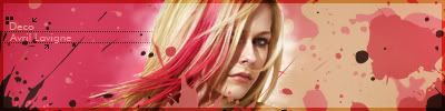
 Sprite animation wallpaper Sprite animation wallpaper
hope its good 

Fur's Gift BOOOO EVERYONE

-
-
first off, normally LP's are to differ themselves from signatures. they are to stand out and convey a feeling and message to the viewer, as minimal as it may seem. Large Pieces are to create a utility for the viewer. one has to consider how to us negative space. directions, coloring, complementing elements and merging everything into a what i like to call a flavour of imagery. what do i mean by this is that large pieces are to be considered a higher ground of design. and should be treated as such.
why do i do this introduction, i do it to convey a message since it seems you are barely starting out to move from the mianstreem of signage, as for the piece itself it could have been clearle cut down and resized as a sig, what do i mean its just a big signature.
tje vectorial background is as whored and un-original that when using them they have to be justified more thant just looking good to pull them off in a god way.
as for the starry sky, in a sunset background comes allong as noise, and noince in a design translate to distraction, so at the end it comes off as more of a distraction than a utitlity to create and converge in a overall theme/message.
overall this could have had or not vegeta, vejita (however you know him ) and the little animation. because at the end it feels like big nothingness and a pushover atempt to come around as artsy and classy design.
sometimes what looks good by separate joined together comes around as blunt, simple and not very creative.
i would suggest you think before you do. merge your ideas together and try creating soemthign out of the mainstream.
skills and program knowledge can only take you so far, for me at the end thats only a 20% of the final product, time invested, creativity, orignallity give you the 80% rest that allows the viewer to feel they are watching something more than.. well a oversized signature with a bucnh of brushes and gradients.
newest:

Fav :

The true and only Firescorpio!
(no autographs please)
Similar Threads
-
By Quaggy in forum Digital Art
Replies: 6
Last Post: 06-26-2007, 04:50 PM
-
By AcidGlow in forum Sigs & Manips
Replies: 4
Last Post: 03-11-2006, 01:37 PM
-
By imported_AcidGlow in forum Sigs & Manips
Replies: 23
Last Post: 12-24-2005, 06:29 AM
-
By `Kakashi in forum Resources
Replies: 0
Last Post: 12-18-2005, 04:53 PM
 Posting Permissions
- You may not post new threads
- You may not post replies
- You may not post attachments
- You may not edit your posts
-
Forum Rules
|


 Reply With Quote