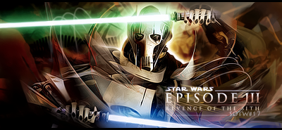
I rly disliek the colors on these. The bright blue and green with the darkish red, it's too much going on. I would reccomend eitehr making it black and white or swicthign them up a bit.
Not bad c4d work but its a little chaotic. Work on making it more minimalistic and working wiht the flow.
Also that white outline around him isnt helping, I'm assuming thats part of the stock and you justd ecided to not cut it out?
haha you rly should et over your laziness and chop it witht he pen tool or something, it rly makes the sig look bad.
while I agree with some of your criticism Papa and I thank you for it, I disagree that I was in anyway "lazy" when desigining it. It is fine if you dont like it, but I enjoyed making it and did not cut corners to make it.


 Reply With Quote


