GFXVoid Graphic Design Forum

Remove Text Formatting
Loading...

» Online Users: 18,417

0 members and 18,417 guests
No Members online

» Site Navigation

 > FAQ

» Stats

Members: 35,442
Threads: 103,075
Posts: 826,688
Top Poster: cc.RadillacVIII (7,429)
Welcome to our newest member, Lekelindids
Results 1 to 6 of 6
  1. #1
    Join Date
    Sep 2008
    Posts
    1,589

    Default Blissfully Forgotten

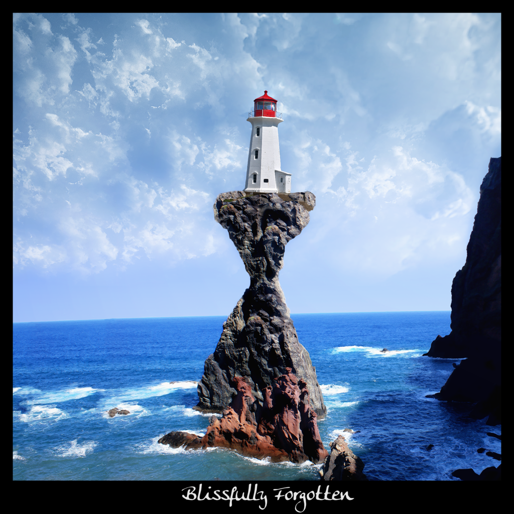
    Finished of one of my WIP manips.

    Rock and Sea Stock:

    http://www.sxc.hu/photo/922192

    Lighthouse Stock:

    http://www.sxc.hu/photo/1023443

    Some usage of this brush:

    http://greenaleydis-stock.deviantart...hes-I-94230572

    Spent a lot of time widening the sea and blending the 6 images together.

    I hope you like it I think it looks pretty cool myself.

    Resized PB image:


    For full view goto the devaintart page:

    http://bonesma.deviantart.com/art/Bl...tten-113096924

    and click download.

  2. #2
    Join Date
    Sep 2008
    Location
    Australia
    Posts
    2,310

    Default

    Very Nice Bones.
    Lighting is a bit off and a bit more Water wash wouldn't hurt, but I've already mentioned that to you.
    The rest of the image had been blended in fairly nicely and the clouds look great.

  3. #3
    Join Date
    Feb 2007
    Location
    American by birth, southern by the grace of God.
    Posts
    2,564

    Default

    Not bad very nice bones, only thing to me is the triangle part of the rock that the light house is on seems a little 2-D to me, and kind of fake

  4. #4
    Join Date
    Sep 2008
    Posts
    1,589

    Default

    tnks working on the rock and water splash soon

  5. #5
    Join Date
    Feb 2009
    Location
    Manchester/Liverpool, UK
    Posts
    255

    Default

    yeah the lighting seems a little weird but its great! I love stuff like that, people actually using their brains to make something, gj!

  6. #6
    Join Date
    Dec 2008
    Location
    Evansville, IN
    Posts
    134

    Default

    The lighthouse and the rocks their on could use a bit of bluring on the edges, to help get rid of the 2-D feel. Apart from that, bravo.

    "A little sincerity is a dangerous thing, and a great deal of it is absolutely fatal."

Similar Threads

  1. Forgotten
    By Toshiyan in forum Digital Art
    Replies: 5
    Last Post: 01-29-2007, 03:07 PM
  2. Forgotten.
    By Dreiko Shadrack in forum Digital Art
    Replies: 6
    Last Post: 01-15-2006, 11:15 AM
  3. Forgotten
    By affekt. in forum Digital Art
    Replies: 5
    Last Post: 10-03-2005, 06:57 PM
  4. Forgotten
    By imported_forgotten in forum Introductions
    Replies: 1
    Last Post: 07-07-2005, 03:06 AM
  5. With the help of Forgotten...here's my new sig.
    By Digifruitella in forum Sigs & Manips
    Replies: 14
    Last Post: 04-09-2005, 10:28 AM

Posting Permissions

  • You may not post new threads
  • You may not post replies
  • You may not post attachments
  • You may not edit your posts
  •  
Powered by vBadvanced CMPS v4.1.1