0 members and 782 guests
No Members online

» Site Navigation

» Stats
Members: 35,442
Threads: 103,075
Posts: 826,688
Top Poster: cc.RadillacVIII (7,429)
|
-
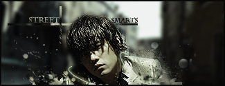
 Street Smarts Street Smarts
Made this for a battle im in CnC
-
Ooh, some nice effects on that.
Somethings are bothering me though:
It's VERY contrasted, I like the lighting, but it's too dark in some places.
The text is bleh, I don't like the lines that go horizontally across it.
His hair looks slightly over sharpened.
It's a great sig, and I like the effects, but some aspects seem a bit off.
Good luck in your battle. 
 Originally Posted by MarkPancake

MarkPancake banned.
Success.
-
nice effects around him
but i think he stands out just a little too much
perhaps over blurred bg or over sharpened image
its nice effects though
-
the cross needs not to be there or to be blended slightly or lowered opacity. apart from that its good stuff
My Newest
Making A Tutorial: Off Mail me if you wanna collaberate.
Similar Threads
-
By Grumpylump in forum Digital Art
Replies: 8
Last Post: 01-09-2008, 03:24 PM
-
By Fallen Angel in forum Sigs & Manips
Replies: 5
Last Post: 07-24-2005, 11:42 AM
-
By narcosynthesis in forum Digital Art
Replies: 4
Last Post: 07-17-2005, 11:00 AM
-
By Spid3r in forum Digital Art
Replies: 9
Last Post: 07-17-2005, 01:57 AM
 Posting Permissions
- You may not post new threads
- You may not post replies
- You may not post attachments
- You may not edit your posts
-
Forum Rules
|


 Reply With Quote


