GFXVoid Graphic Design Forum

Remove Text Formatting
Loading...

» Online Users: 1,198

0 members and 1,198 guests
No Members online

» Site Navigation

 > FAQ

» Stats

Members: 35,442
Threads: 103,075
Posts: 826,688
Top Poster: cc.RadillacVIII (7,429)
Welcome to our newest member, Lekelindids
Results 1 to 3 of 3

Thread: wip-ish FF lp

  1. #1
    Join Date
    Jun 2008
    Location
    US of A
    Posts
    707

    Default wip-ish FF lp


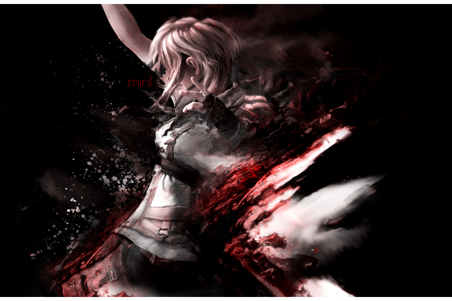
    Idk, ok, its like a sig style lp... like i did a sig and blew it up a lot.
    C&C please, its not completely done but I'm kinda stuck.. :P

    Et Tu?
    SilentShadow | Jorrne | Arcmenis | Garis | Splinter | Sanbu | DeadlesS | Tekken | Proflax | Suddu
    -


  2. #2
    Join Date
    Jul 2007
    Location
    Lithuania
    Posts
    3,611

    Default

    oho. loooks niCe ;]
    I think text is in wrong place.
    I would move it somewhere to the right.
    And I dont know. maybe few pen tool lines around her.
    Or some blue C4Ds.
    You need something dramatic there. ;]
    keep it up


  3. #3
    Join Date
    Feb 2007
    Location
    American by birth, southern by the grace of God.
    Posts
    2,564

    Default

    very nice miril, I would move the text like garis said and add a lil more boom in it and you would have a very nice art work

Posting Permissions

  • You may not post new threads
  • You may not post replies
  • You may not post attachments
  • You may not edit your posts
  •  
Powered by vBadvanced CMPS v4.1.1