0 members and 437 guests
No Members online

» Site Navigation

» Stats
Members: 35,442
Threads: 103,075
Posts: 826,688
Top Poster: cc.RadillacVIII (7,429)
|
-
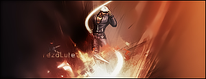
 I tried something new :D I tried something new :D
Hehe.. CnC plz 
(Second sig here, ftw)

-
I like this one Overall very good I think. Nice placement and the text fits in well  
-
it should fit in, it's set on Overlay :P
-
its better than your first one, however its very monotone, you want to get a few colours going in your designing, ill be honest, i dont like the darkening around the edges, and if you place your text way away from your focal and make it stand out, then it will distract from where you want people to look, this is just my opinion, keep reading tuts, and have fun <3
-
thanks for the advice ! I'll see what i can do.
-
great lighting and composition.. dont be afraid to use more colors
-
lacks depth badly. could use a little more contrast i think. overall, you need to work on your depth.
Last edited by rezoLute; 04-14-2009 at 01:50 AM.
favorite:
sotw:
 rrrrreLax.Designsssss
rezoLute
 Originally Posted by Some guy off another forum...
I never said Fall Out Boy were emo, you tottering simpleton.
^i lawled^
-
It would be really nice if there was more colour too it - but I looks slightly 'bland' because its all one tone.
 Posting Permissions
- You may not post new threads
- You may not post replies
- You may not post attachments
- You may not edit your posts
-
Forum Rules
|


 Reply With Quote

