GFXVoid Graphic Design Forum

Remove Text Formatting
Loading...

» Online Users: 1,202

0 members and 1,202 guests
No Members online

» Site Navigation

 > FAQ

» Stats

Members: 35,442
Threads: 103,075
Posts: 826,688
Top Poster: cc.RadillacVIII (7,429)
Welcome to our newest member, Lekelindids
Results 1 to 5 of 5
  1. #1
    Join Date
    Oct 2007
    Posts
    2,782

    Default Casualties of war.

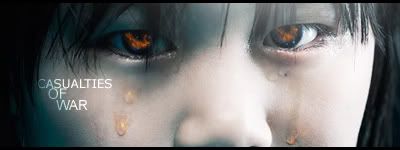
    May aswell post it up for some cnc.


    A little photo manip sig.


    Text sucks but its only there for the sotw.


  2. #2
    Join Date
    Jan 2009
    Location
    Northamptonshire, England
    Posts
    294

    Default

    Despite me hating close-up sigs, I quite like this one. It's actually interesting and the eyes aren't normal and boring. The tears are better in V2, don't know why, but they seem to make it look more fitting rather than an edit on the eyes alone. My only gripe on this would be the text. Good sig considering the type of it, which I've not been a fan of because most results seem too... boring and normal... and not very vibrant.

  3. #3
    Join Date
    Oct 2007
    Posts
    2,782

    Default

    Thanks stig


  4. #4
    Join Date
    Apr 2009
    Location
    AZ
    Posts
    659

    Default

    love the reflection in the eyes, some good work!

    as already said by you text need work

  5. #5
    Join Date
    Apr 2009
    Location
    Manchester / Cheshire
    Posts
    406

    Default

    I love it - but the orange tears are slightly... off putting...
    I'd make them an 'unnatural' blue... but not OVERLY blue.
    Be a nice touch imo.

Posting Permissions

  • You may not post new threads
  • You may not post replies
  • You may not post attachments
  • You may not edit your posts
  •  
Powered by vBadvanced CMPS v4.1.1