0 members and 18,746 guests
No Members online

» Site Navigation

» Stats
Members: 35,442
Threads: 103,075
Posts: 826,688
Top Poster: cc.RadillacVIII (7,429)
|
-
 I'm finally happy... I'm finally happy...
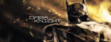
I'm actually finally happy with everything about this sig piece. I worked on this FOREVER, changing placements, starting all over (numerous times) and getting my colors how I like them.... Hell, I even like the TEXT!! Now is the big question... what do YOU think? I made two different versions, one has a slightly different color than the other....
CnC?
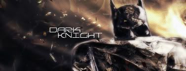
OR
-
text is too bright imo. ew to the scan lines. needs depth.
favorite:
sotw:
 rrrrreLax.Designsssss
rezoLute
 Originally Posted by Some guy off another forum...
I never said Fall Out Boy were emo, you tottering simpleton.
^i lawled^
-
Not too bad!
I agree with you i like the text. it's pretty fitting for this sig. 
IMO the bg isnt bad, the scanlines need to go, yes, but the bg is cool.
What i dont like is the odd choice in render. The render just seems destroyed. And i dont know if thats how you found it, or what but i'd either try and fix it, or i'd drop it and pick a new render than goes with that sleek BG a bit more.
It's pretty cool just the render's deformities and weirdnesses just distracts a lot.
 My DevART
RATCHET is my bitch
Andrew says:
u ever stolen a bible?
Apathy says:
no
used the last two pages to roll a joint though
Andrew says:
wow
thats fucking hard core
^^HAHAHA, dm sucks XD
-
Pretty good if you ask me. I like the first one, the second one's a little too bright. I like the text too, it fits with the theme. But the colour doesn't really blend in.
I agree, scanlines= No, no.
The effects are not too bad either! But like Papa said, the render looks screwed up. Maybe change it to another that still fits in with the background colour and effects? I dunno.
Add in a border 
Good job
-
I really like this, I'm not sure what it is about it, I just really like it. I think it's good that your happy with it too, always makes it easier to advance. Good job.
-
i like the first one better, i think that everything comes together a lil better on that one
-
Thanks guys! I'm flying high today, having a GREAT day at work, and getting GREAT feedback on something that I'm very proud of. Plus, here in Michigan, it's gonna be almost 70 degrees F... AMAZING...
@PaPa, that's the way the render looked... I will try to find a suitable replacement, and see what I think. Thanks to EVERYONE for the input...
Any others?
-
very nice by far your best yet scan lines and the render dont fit but that can be easily amended bg is awsome|
-
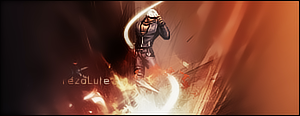
so here it is with a different render, and a little bit of a different color to it...
I know his ears are cut off, but if I made it smaller, it looked really bad, and if I just brought it down you couldn't see his fists (which I thought was way cool)... I also made the text not so bright, and added a border!

-
ooo i defs like the new one. Up around the head the smudging kinda turns me off :P
amazing work though, I love it
Similar Threads
-
By The Fallen in forum Introductions
Replies: 9
Last Post: 05-12-2009, 03:41 AM
-
By Elramo in forum Sigs & Manips
Replies: 4
Last Post: 06-30-2008, 09:43 AM
-
By Death of a Clown in forum Digital Art
Replies: 4
Last Post: 06-11-2006, 10:07 PM
-
By Juicy in forum Sigs & Manips
Replies: 11
Last Post: 07-18-2005, 11:17 AM
-
By -Kanji- in forum Sigs & Manips
Replies: 10
Last Post: 04-03-2005, 01:54 PM
 Posting Permissions
- You may not post new threads
- You may not post replies
- You may not post attachments
- You may not edit your posts
-
Forum Rules
|


 Reply With Quote


