0 members and 24,013 guests
No Members online

» Site Navigation

» Stats
Members: 35,442
Threads: 103,075
Posts: 826,688
Top Poster: cc.RadillacVIII (7,429)
|
-
 Laharl Laharl
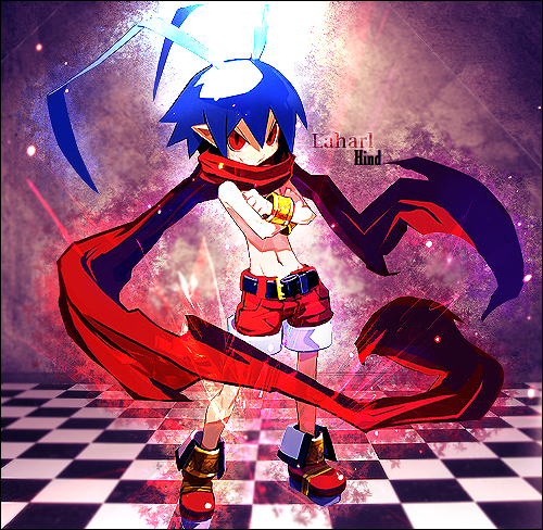
C&C please! I know it may not look that great as I am new to photoshop but I would still like to thank Rachet for his awesome tuts.
I learnt a lot from them and just applied them here. Also, for replying my pms asking for help/advice. Thanks!
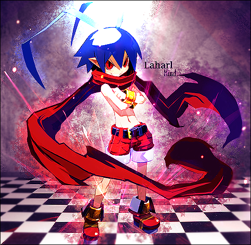
V2 -
V3 -

Last edited by Hind; 04-24-2009 at 11:04 PM.

Adobe Photoshop - [CS4]
Editing since April '09

-
This should be in digital art, not sig/avatar, however with that being said, you have some nice effects going, but it looks like you put them all on color/linear dodge, try screen or lighten instead, gives a smoother effect <3 text is okay but take the top text off overlay,
-
Thanks, I've been totally clueless at using C4D in my work since most of them have backgrounds and I didn't think of changing the blending options.
Hmmm, thanks for the advice. I'll edit it and put it up.
Last edited by Hind; 04-24-2009 at 11:05 PM.
Adobe Photoshop - [CS4]
Editing since April '09
-
There ya go.
V2 is with the blur effect, V3 without. Which looks better?
Adobe Photoshop - [CS4]
Editing since April '09
-
They still look oversharpened =[
-
Edited V3, how's that now? I sharpened it once instead of twice this time, and I also blurred the background up till about halfway of the floor.
Last edited by Hind; 04-24-2009 at 11:58 PM.
Adobe Photoshop - [CS4]
Editing since April '09
-
It looks too smudged, sharpened and overlayed. the colours are quite stange and it could do without the bottom half where the floor begins.
-
I'll bear that in mind, thanks. I'll edit it soon I guess. Any advice on how I can improve it?
I understand how to correct the sharpness and smudges though, but what do you mean by too overlayed?
The colours aren't much different from the original render. I just used a purple/red gradient map and I got this effect.
Adobe Photoshop - [CS4]
Editing since April '09
 Posting Permissions
- You may not post new threads
- You may not post replies
- You may not post attachments
- You may not edit your posts
-
Forum Rules
|


 Reply With Quote