0 members and 1,748 guests
No Members online

» Site Navigation

» Stats
Members: 35,442
Threads: 103,075
Posts: 826,688
Top Poster: cc.RadillacVIII (7,429)
|
-
04-23-2009, 01:19 PM
#2571

Top: looks good, i love sprites but i suck at them, the flow needs some work though 7/10
Bottom: like the effects, only thing that ruins it for me is the text that says "with ourselves" Also border kinda weird. But still 7/10
well done :P
-
04-23-2009, 01:21 PM
#2572
8/10. I like the colours. They strike western to me so you did a good job. The focal is blended in well too and it's simple, nice looking. 
-
04-23-2009, 01:36 PM
#2573
favorite:
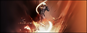
sotw:
 rrrrreLax.Designsssss
rezoLute
 Originally Posted by Some guy off another forum...
I never said Fall Out Boy were emo, you tottering simpleton.
^i lawled^
-
04-25-2009, 09:48 AM
#2574
-
04-25-2009, 09:55 AM
#2575
intersting bg
but i want some more details 
7/10
too bright for me.
6/10
-
04-25-2009, 10:02 AM
#2576
8+1/10
+1 cus the girl is hot. so 9/10. Lol!

Adobe Photoshop - [CS4]
Editing since April '09

-
04-25-2009, 10:27 AM
#2577
I think the girl looks like a donkey to be honest :P
Your sig has a nice upward flow, good lighting, border is off. Sides look a bit empty.
Overall pretty decent 7/10
-
04-25-2009, 10:34 AM
#2578
Ah well, to each his own.
Hmm, I did try to add more to the sides, I just couldn't seem to get any nice complementing C4Ds. I tried using fractals but they sucked big time so I just left them empty. Any advice on what kind of border I should use?
8.5/10, it's good. I've got nothing bad to say about it. You've grasped the whole western flow thingy pretty well there. Overall, a good sig, and I like it. Haha
Only thing I can think of is, what in the world is that flowery thingy at the bottom right hand corner?
Adobe Photoshop - [CS4]
Editing since April '09
-
04-25-2009, 11:43 AM
#2579
-
04-25-2009, 02:07 PM
#2580
7/10
I love the effects coming from the sword and I really like Clipping Masks and it was used really well there, but I think the text could use a different colour...

- ~- Big Boss -~-

Latest
Similar Threads
-
By SgtSwabs in forum The Void
Replies: 16
Last Post: 12-06-2005, 08:42 PM
-
By LunarPoet in forum Sigs & Manips
Replies: 1
Last Post: 06-23-2005, 12:31 PM
-
By Xavier in forum Sigs & Manips
Replies: 8
Last Post: 06-03-2005, 01:46 AM
 Posting Permissions
- You may not post new threads
- You may not post replies
- You may not post attachments
- You may not edit your posts
-
Forum Rules
|


 Reply With Quote


