0 members and 390 guests
No Members online

» Site Navigation

» Stats
Members: 35,442
Threads: 103,075
Posts: 826,688
Top Poster: cc.RadillacVIII (7,429)
|
-
-

that looks really cool. And i mean it.
This must be one of the first dark signature's i've really liked. Mos areas of it works well.
The text placement was a really neat idea.
2 things you could perhaps fix up. The areas around his hair look to pixely.. perhaps fade the sharpness there and maybe include a border.
-
i feel like you could maybe crop the ends a little bit since they are rather blank but also keep in mind you dont want it to feel to square.
-
Wonderful effects, but I was thinking you could actually try cropping it in line with the effects, so that you have more of a U shaped sig.
Just try it out, I have no idea if it'll look alright, but try cropping it slightly in one way or another. 
It's got great depth, but the lack of luster/colour on the side ruins the effects in the middle.
Nice, nice, nice work!
 Originally Posted by MarkPancake

MarkPancake banned.
Success.
-
"Imagination Is More Important Than Knowledge"
Latest

Favourite
 "Together We Stand Strong"
-
Cant say that I like it, sorry 
Its too dark, the white stuff looks like low quality and the render just doesnt fit, also theres no border, but I see you never do that :P
Keep going
-
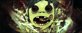
hmm... its nice, except the c4d part, the c4d below his face is worsening him off. i like the black part. the text looks good on his tounge, but! some colors can do the trick. Just a pinch! i hope u got what i said 
Fur's Gift BOOOO EVERYONE

-
-
cool but maybe more vector effects to match
Similar Threads
-
By NSR in forum Sigs & Manips
Replies: 2
Last Post: 10-22-2007, 03:45 PM
-
By Xobile in forum Sigs & Manips
Replies: 5
Last Post: 03-12-2006, 11:27 AM
 Posting Permissions
- You may not post new threads
- You may not post replies
- You may not post attachments
- You may not edit your posts
-
Forum Rules
|


.


 Reply With Quote