0 members and 4,710 guests
No Members online

» Site Navigation

» Stats
Members: 35,442
Threads: 103,075
Posts: 826,688
Top Poster: cc.RadillacVIII (7,429)
|
-
04-30-2009, 07:36 AM
#2621

7/10 im just not feeling this one =[
7/10 nice wireframe work and effects, though too much empty space for me
-
04-30-2009, 09:17 AM
#2622
8/10 not feeling the text
9/10 ii think its funny 
Recent Work:
TRANSFORMERSSSS!

 Mortal KOMBAAAT Mortal KOMBAAAT

-
04-30-2009, 09:40 AM
#2623
First one is pretty good. But to empty on the right side, nice colors thou. 8/10
Hmmm... Too much blurry splatter and to little action. 5/10
The text in both needs work ^u^
-
04-30-2009, 09:48 AM
#2624
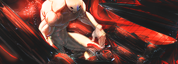
7/10 nice idea imo, with kakashi and his chidori, but the image is low quality and that ruins it for me, also the bg is a little flat =/
6/10. way too many effects, they just kinda form a block in the middle of the canvas, that really doesnt do anything for me
-
04-30-2009, 05:59 PM
#2625
-
04-30-2009, 06:09 PM
#2626
Bottom 7.10 Nice effect but could have been executed better.
Top 5/10 Not feeling the colors.
-
04-30-2009, 07:24 PM
#2627
7/10, nice effects but im not feeling the text and the background is flat.
-
04-30-2009, 10:13 PM
#2628
Link no worky.
SO 10/10.
THAT IS THE GENERATION DEFINING "X"
Edit:
Posted before I did D:
A little messy with the c4d's.
render doesn't add a whole lot to the sig.
Text could be better.
6/10
2nd is pretty hawt.
Love colors and text.
8.5/10
Last edited by CharDude; 04-30-2009 at 10:15 PM.
-
04-30-2009, 10:20 PM
#2629
1st 8.5/10 looks sick.
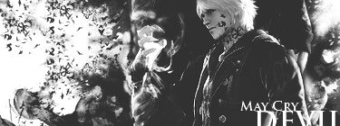
2nd 7.5/10 nice work, i dont always dig bw.
-
04-30-2009, 10:34 PM
#2630
First one is small, but still looks good. 8/10
Second is sick. I really like the effects. 9/10.
Similar Threads
-
By SgtSwabs in forum The Void
Replies: 16
Last Post: 12-06-2005, 08:42 PM
-
By LunarPoet in forum Sigs & Manips
Replies: 1
Last Post: 06-23-2005, 12:31 PM
-
By Xavier in forum Sigs & Manips
Replies: 8
Last Post: 06-03-2005, 01:46 AM
 Posting Permissions
- You may not post new threads
- You may not post replies
- You may not post attachments
- You may not edit your posts
-
Forum Rules
|


 Reply With Quote