0 members and 7,073 guests
No Members online

» Site Navigation

» Stats
Members: 35,442
Threads: 103,075
Posts: 826,688
Top Poster: cc.RadillacVIII (7,429)
|
-
05-02-2009, 11:07 PM
#2641

Love the text blend. There's to much and to visible effects who takes over the whole thing.
6/10
Not gonna rate this one cuz Its made from a tut. Nice outcome thou 
Last edited by cc.RadillacVIII; 05-02-2009 at 11:11 PM.
-
05-02-2009, 11:36 PM
#2642
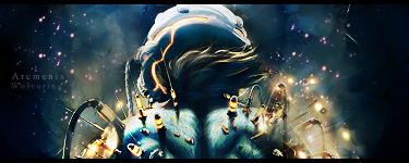
5.5/10, Choice of colours is good. Too messy though, a lot of un-needed effects like the wavy greenish things. Not a fan of the BG either. That line of fire thing seems completely pointless to me. The pointless BG and effects just destroy the sig for me. Other than that, the render is blended nicely, the leafy effects complement the render and like I said, choice of colour is good.
4/10, for a sprite sig, the flow in this one is REALLY bad. You have to understand that because sprites don't look good by themselves (because they are really plain), the effects that complement them have to stand out much more than normal sigs. Try to pick a sprite that's actually performing an action, it's easier to create a flow with that. You might also want to take a look at rezolute's sprite sig. He did a bang up job with his even though his sprite was in a standing position. Other than that, the text looks good but I can hardly see it, the colours are an eyesore, it's not smooth enough. Try using some layer adjustments like gradient maps or photo filters.
For me, I made my effects stand out to attract more attention toward the effects. Of course, I still sharpened the sprite and blurred the effects, and the main focal is still the sprite itself. Btw, I followed Splinter's tut for this sig. Not step by step, but I did get the basics from there.
6/10, once again, the effects aren't doing much for me. The colours clash, and I don't know why but it looks a little LQ.
In a nutshell, read up on Splinter's sprite sig tutorial and try to cut down on unnecessary effects. Sometimes, more doesn't mean better. Sorry man, my critique might seem harsh but I know you can do better work than this, I've seen them before. Oh and why can't you rate a sig that was made from a tut? Some tuts are hard to follow and thus, most of them require you to add in a touch of your own.
Last edited by Hind; 05-02-2009 at 11:46 PM.

Adobe Photoshop - [CS4]
Editing since April '09

-
05-02-2009, 11:59 PM
#2643
Awesome work mam but to me there is alot of empty space other then that its just a great sig
8/10
this one is just flawless
10/10
   <--Click baby eggs please! <--Click baby eggs please!
-
05-03-2009, 12:07 AM
#2644
5/10, nice effects. Clipping masks destroy the sig though. Imo it would look better without those. Not a fan of the text as well. Your BG is TOO empty. Render is a painted kind of art work so it looks a little blurry, no depth whatsoever. I think you should redo this, sharpen the area you want to be your focal and blur the rest, this would add depth, add something to the BG, remove the clipping masks, maybe add a lightsource, read Papa's text tut, and you're good to go.
Adobe Photoshop - [CS4]
Editing since April '09
-
05-03-2009, 12:09 AM
#2645
Thanx ^u^ No im pretty good att taking critics and Its just for the good.
And those two signs already had some critics, the alba sig is in version 4, so its been worse. And i know, im a c4d ripple whore ^u^
My sprite is a half failure, too much smudge and no action. Tryd to make a sprit sign with the method of a regular one, obvious that it didnt succeed, and at the current state im stuck whit that.
About youre papa tut sign. I think Its ok to follow a tut and use youre own render and touch, but when you use the same render as the creator you seams more as a copycat. I think tuts for guidelines, not kinda ripping,
But i must say that yours better looking then papas
No hard feelings.
Last edited by cc.RadillacVIII; 05-03-2009 at 12:13 AM.
-
05-03-2009, 12:12 AM
#2646
Of course not! We're all here to help each other improve. I've seen much of your work and I think you can definitely do better.
Just cut down on the C4D whore-ing and try to use some layer adjustments to blend your colours nicely.
Adobe Photoshop - [CS4]
Editing since April '09
-
05-03-2009, 12:32 AM
#2647
*Swosh*
''The sounds of Radillac going to c4d rehab''
-
05-03-2009, 06:27 AM
#2648
7/10. Love the colouring, but I'm not a fan of chaotic sigs.
8/10. Effects are nice. The render is a bit small though.
Last edited by Stiggeh; 05-03-2009 at 06:29 AM.
-
05-03-2009, 06:43 AM
#2649
7/10 looks pretty good but plain at same time, nice clipping mask but dont like the text warmth!
8.5/10 loooks really nice blends great nice effects and i love the text! 
-
05-03-2009, 06:58 AM
#2650
5/10 Uhh... Yea..
5/10 You used brushes for effects.
Similar Threads
-
By SgtSwabs in forum The Void
Replies: 16
Last Post: 12-06-2005, 08:42 PM
-
By LunarPoet in forum Sigs & Manips
Replies: 1
Last Post: 06-23-2005, 12:31 PM
-
By Xavier in forum Sigs & Manips
Replies: 8
Last Post: 06-03-2005, 01:46 AM
 Posting Permissions
- You may not post new threads
- You may not post replies
- You may not post attachments
- You may not edit your posts
-
Forum Rules
|


 Reply With Quote


