0 members and 1,537 guests
No Members online

» Site Navigation

» Stats
Members: 35,442
Threads: 103,075
Posts: 826,688
Top Poster: cc.RadillacVIII (7,429)
|
-
-

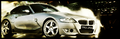
blending needs work, it looks as if u pasted the car on a smudged bg. should have done some better bg there coz black isnt going wwith super bright smudging. and the text is not fitting on the no plate. Al though i like the lower part os the sig
Fur's Gift BOOOO EVERYONE

-
It looks good, and the lighting is nice, and so is your blending, but you could add something that would compliment the flow a bit more.
I don't really like the license plate, not sure if that was part of the render, or your text or whatever, but it doesn't look real enough to have in there.
Other than that, it's pretty good, just make sure that the render and the background combine well. 
 Originally Posted by MarkPancake

MarkPancake banned.
Success.
-
nice car ,maybe u cud motion blur the BG so that the car looks running, fx is too bright and white but its a cool tag overall, KIU m8
-
Smudging looks good. I can't really tell the difference between the smudging and the car near the front and back areas of the car though. I don't think that's a good thing. Maybe you should fix that? The contrast between the smudged area and the BG isn't too good either,I think you should work on that too. Pretty simple sig, but sometimes, simplicity works. Fix that license plate though. It looks a little too fake to be on the car, just like Ptka said. It doesn't look real because it's much sharper than the car itself, so, go figure!
Hope to see a V2 soon, bud. 
Last edited by Hind; 05-07-2009 at 07:22 AM.

Adobe Photoshop - [CS4]
Editing since April '09

 Posting Permissions
- You may not post new threads
- You may not post replies
- You may not post attachments
- You may not edit your posts
-
Forum Rules
|


 Reply With Quote


