GFXVoid Graphic Design Forum

Remove Text Formatting
Loading...

» Online Users: 7,304

0 members and 7,304 guests
No Members online

» Site Navigation

 > FAQ

» Stats

Members: 35,442
Threads: 103,075
Posts: 826,688
Top Poster: cc.RadillacVIII (7,429)
Welcome to our newest member, Lekelindids
Page 269 of 496 FirstFirst ... 169219259267268269270271279319369 ... LastLast
Results 2,681 to 2,690 of 4959
  1. #2681
    Join Date
    Apr 2009
    Location
    Portugal
    Posts
    355

    Default

    1.

    render is a bit oversharpened, you should have civen the render the shades from the 2nd light source..and im not a fan of the color scheme.. 5/10
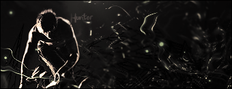
    2.

    the blending is good, c4d's well used and lightning is okish...not too keen on the background..7/10

  2. #2682
    Fuzer is offline ◦○║►теαм ђаzέ™◄║○◦
    Join Date
    Feb 2009
    Location
    Aylesbury, England.
    Posts
    746

    Default

    6/10, looks a little unfinished and the shading is a little off imo.
    1337/10 ;D gfx teams ftw!

  3. #2683
    Join Date
    Apr 2008
    Location
    Sweden
    Posts
    7,429

    Default

    Woho Inly bad thing is the two c4d dots on his left arm who stands out to much, near his shoulder and the elbow. 10/10

    I just love the colors of choice. Gradient frames just so perfect. Same rate as above
    Last edited by cc.RadillacVIII; 05-08-2009 at 02:20 PM.


  4. #2684
    Fuzer is offline ◦○║►теαм ђаzέ™◄║○◦
    Join Date
    Feb 2009
    Location
    Aylesbury, England.
    Posts
    746

    Default

    10/10 for both? ^^ Woot, works for me. As for yours:

    6/10 the background looks really over contrasted, and the guy itself looks oversharpened.
    7.5/10 decent effects, looks really messy though, and shes too small for the size of the tag imo

  5. #2685
    Join Date
    Dec 2008
    Location
    Gujrat, India
    Posts
    1,926

    Default

    6.5/10 the c4d's are unnecesary at some places
    8/10 its nice but the colors are too vibrant
    Fur's Gift BOOOO EVERYONE


    Apathy and i talk shit about everything.
    Kritez you have unyil yomottoe
    KidBuu is that latin?
    Kritez yes

    [DeviantART] [GrayMoon Studios]

  6. #2686

    Default

    Quote Originally Posted by KidBuu View Post
    6.5/10 the c4d's are unnecesary at some places
    8/10 its nice but the colors are too vibrant
    First one: 7/10
    Second one: 8/10 I like the colors.
    Favorite Tag


    Newest Tag
    (SotW)


  7. #2687
    Join Date
    May 2009
    Location
    Usa, soon to be in Japan
    Posts
    51

    Default

    9/10 and 10/10 there both awesome. when i get better and know wut each button does then i culd judge ur sig and give u advice. but hey i just started making sigs tuesday. lol so mabye a month from now i'll be better. xD
    Newerest


  8. #2688
    Join Date
    Jul 2007
    Location
    Lithuania
    Posts
    3,611

    Default

    background and text ruins everything 2/10
    dont like the text. BG looks empty 2/10


  9. #2689
    Join Date
    Oct 2008
    Location
    The Netherland
    Posts
    566

    Default

    9/10 it pwnz zd


  10. #2690
    Join Date
    Apr 2008
    Location
    Sweden
    Posts
    7,429

    Default

    Loose the text and it's perfect


Similar Threads

  1. Rate The Sig Above!
    By SgtSwabs in forum The Void
    Replies: 16
    Last Post: 12-06-2005, 08:42 PM
  2. *NEW* Rate Avatar? Rate Sig?
    By LunarPoet in forum Sigs & Manips
    Replies: 1
    Last Post: 06-23-2005, 12:31 PM
  3. Rate my Signature...
    By Xavier in forum Sigs & Manips
    Replies: 8
    Last Post: 06-03-2005, 01:46 AM

Posting Permissions

  • You may not post new threads
  • You may not post replies
  • You may not post attachments
  • You may not edit your posts
  •  
Powered by vBadvanced CMPS v4.1.1