0 members and 730 guests
No Members online

» Site Navigation

» Stats
Members: 35,442
Threads: 103,075
Posts: 826,688
Top Poster: cc.RadillacVIII (7,429)
|
-
05-14-2009, 06:34 PM
#2701

good blending and good depth 10/10 for both good job man
   <--Click baby eggs please! <--Click baby eggs please!
-
05-14-2009, 06:52 PM
#2702
awesome sig 10/10 hulk looks real cool

Newerest


-
05-14-2009, 07:31 PM
#2703
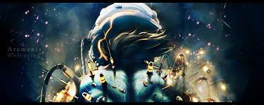
5/10 for both. The first lacks alot of depth, and beveled tags = fail imo.
Second im not fond of the graffiti style text, it doesnt fit, and the render isnt really blended in at all, sorry dude.
-
05-15-2009, 07:55 AM
#2704
1st b&w sigs are my fav, nice depth and effect but dont like text and white dots 8/10
2nd only one word... amazing 10/10
Epic Maze by RadillacVIII


-
05-15-2009, 08:49 AM
#2705
7/10 but whats the second one i cant see it clearly XD
-
05-15-2009, 09:50 AM
#2706
8/10 Nice sig and love the colours
8/10 Nice effects
-
05-15-2009, 09:58 AM
#2707
7/10 not fond of the text or the white smoke effect
-
05-15-2009, 10:55 AM
#2708
8/10 nice light and blending 
9/10 Amazing !!


A collab with a friend
Last edited by Misterrr; 05-15-2009 at 10:58 AM.
-
05-15-2009, 11:27 AM
#2709
6.5/10, colours in his shades don't match the colours in the tag, but that's a cool concept. You could do better with the background and text though.
8.5/10, nice  . Not liking the text again. . Not liking the text again.

Adobe Photoshop - [CS4]
Editing since April '09

-
05-15-2009, 11:29 AM
#2710
Similar Threads
-
By SgtSwabs in forum The Void
Replies: 16
Last Post: 12-06-2005, 08:42 PM
-
By LunarPoet in forum Sigs & Manips
Replies: 1
Last Post: 06-23-2005, 12:31 PM
-
By Xavier in forum Sigs & Manips
Replies: 8
Last Post: 06-03-2005, 01:46 AM
 Posting Permissions
- You may not post new threads
- You may not post replies
- You may not post attachments
- You may not edit your posts
-
Forum Rules
|


 Reply With Quote


