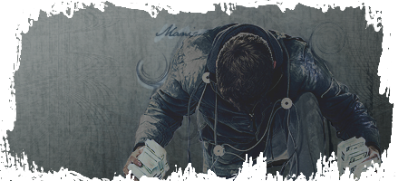
Topaz'd
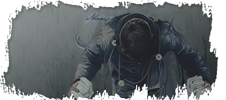
the topaz looks okay, but also kills it, yet the non topazed looks like it needs it. I think you need to find a bit between the two.
Visit My Deviant Art Tutorials [Stalker][Spidey][Clipping Masks] Originally Posted by Syn [29-07, 08:20] You're a bit weird, aren't you Lewk? Lol Originally Posted by Apathy [17-10, 19:37] 720p you can see the razor burn on the crotch
^ agreed. I think the Topaz over the text ruined the text too. Hmm, the render look nice with Topaz, but you lose detail in the background with it.
id see needs a bit more contrast, and maybe some more effects. The border's okay but tis nto enough to carry the sig. Lower the topaz its over done as well. GJ
My DevART RATCHET is my bitch Andrew says: u ever stolen a bible? Apathy says: no used the last two pages to roll a joint though Andrew says: wow thats fucking hard core ^^HAHAHA, dm sucks XD
Lol k.
I like the first version better. Gj.
I like the topaz version best. This is a nice idea and realy helps with the focal. Good work maybe add in some textures on clipping masks somehow.
Newest Prezy from Rad http://www.bonesma.deviantart.com/ Fav
Forum Rules


 Reply With Quote


