0 members and 779 guests
No Members online

» Site Navigation

» Stats

Members: 35,442
Threads: 103,075
Posts: 826,688
Top Poster: cc.RadillacVIII (7,429)
|
-

Ok, I'll be the negative one here 
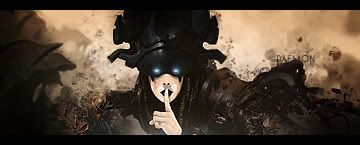
It looks decent, but I just don't feel the render as being part of that image. You have a sci-fi-tech stock and an anime style render and I just don't feel like the 2 blend well, I think the render stands out too much.
text definitely needs work too.
I think it was Immortal that used to do the very cool block text on LPs, might want to look into that if you want to use that kind of font/clip mask.
-

 Originally Posted by Studhorse

Ok, I'll be the negative one here 
It looks decent, but I just don't feel the render as being part of that image. You have a sci-fi-tech stock and an anime style render and I just don't feel like the 2 blend well, I think the render stands out too much.
text definitely needs work too.
I think it was Immortal that used to do the very cool block text on LPs, might want to look into that if you want to use that kind of font/clip mask.
^
-

instead of pointing out that it looks awesome ill try say something i would like improved  (not that it looks bad cuz it don't but you know) I think the render still looks a little pasted in, some places it looks way oversharpened wich just add to the pasted on feeling. The reflections on the pillars need to go imo, it doesnt make the scene realistic and only ad different focal areas. You should give her a shadow to make her look less pasted on. I cant find the place she cast shadow? (not that it looks bad cuz it don't but you know) I think the render still looks a little pasted in, some places it looks way oversharpened wich just add to the pasted on feeling. The reflections on the pillars need to go imo, it doesnt make the scene realistic and only ad different focal areas. You should give her a shadow to make her look less pasted on. I cant find the place she cast shadow?
-
Similar Threads
-
By Garis in forum Member Battles Voting
Replies: 9
Last Post: 07-27-2008, 03:49 PM
-
By Deadloader in forum Digital Art
Replies: 19
Last Post: 08-01-2007, 09:43 AM
-
By tacoX in forum Other Tutorials
Replies: 7
Last Post: 06-09-2006, 08:33 PM
 Posting Permissions
- You may not post new threads
- You may not post replies
- You may not post attachments
- You may not edit your posts
-
Forum Rules
|


 Reply With Quote


 (not that it looks bad cuz it don't but you know) I think the render still looks a little pasted in, some places it looks way oversharpened wich just add to the pasted on feeling. The reflections on the pillars need to go imo, it doesnt make the scene realistic and only ad different focal areas. You should give her a shadow to make her look less pasted on. I cant find the place she cast shadow?


