0 members and 694 guests
No Members online

» Site Navigation

» Stats
Members: 35,442
Threads: 103,075
Posts: 826,688
Top Poster: cc.RadillacVIII (7,429)
|
-
 Spoonman Spoonman

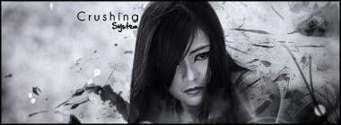
My first try at typography. At something larger than a tag, actually. Comments?
-
Freaking sweet!
Seen this from a tut somewhere, but you changed it up a lot.
Amazing job on the colour especially, it's not flat at all. 
And of course, the depth is great!
Only thing I don't really like is the white circles where the text is going into, that looks off, not as smooth as the rest...
 Originally Posted by MarkPancake

MarkPancake banned.
Success.
-
thankees bud. I'll see if I can do something about the circles.
-
One thing I just noticed, is try and make it like it's in a box, so make a line going on an angle near the middle, so that you get the effect of two walls.
Originally Posted by MarkPancake
MarkPancake banned.
Success.
-
Dawg that's frickin' awesome!
Synsational: "I got so many products in my hair that your Anus hair would probably smooth out too. You'd end up getting a job modeling ass hair for Tres Emme."
-
-
Can I see the tut you used please ^.^ Might learn something from it lol. Anyways yeah nice job, I don't like the circles and some of the shadows are wrong on the text. Also seems a bit over constrasted. A few adjustments this'd be cool 
-
sorry bro, i couldn't find it for some reason. can't remember where it was at. but i'm sure if you typed "3d text tutorial" on google or something you'd find a good one. there's a bunch i looked through.
 Posting Permissions
- You may not post new threads
- You may not post replies
- You may not post attachments
- You may not edit your posts
-
Forum Rules
|


 Reply With Quote
![[system]'s Avatar](image.php?u=21561&dateline=1231635610)