0 members and 816 guests
No Members online

» Site Navigation

» Stats

Members: 35,442
Threads: 103,075
Posts: 826,688
Top Poster: cc.RadillacVIII (7,429)
|
-
06-10-2009, 12:13 PM
#151

Stardust, the end result isn't bad but your render is stretched; when re-sizing a render always drag from the corner and press the shift key so the render/stock doesn't stretch. 
-
06-11-2009, 06:30 PM
#152

KoRRupT
Latest:

-
06-12-2009, 05:14 AM
#153

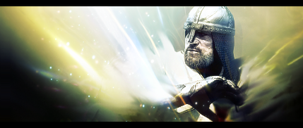
my outcome:

great tut! thanks
-
06-12-2009, 05:26 AM
#154

 Originally Posted by KoRRupTFX

 Originally Posted by theclan10

my outcome:

great tut! thanks
Two fantastic results in a row, great colours,render choices and text.
Simple and clean well done 
-
06-13-2009, 11:26 PM
#155

i went with a different approach, but i think it looks cool

p.s. love your tutorials, very easy to follow!
-
06-14-2009, 03:42 AM
#156

 Originally Posted by DOMINO

Q: sry..im having trouble with smoke..it's not render so you want me to magic erase the backround ?
A: you dont have to magic erase the bg of the smoke layer, after you go to Image - Adjustments - Invert, then set that layer to Color dodge, and then Image - Adjustments - Desaturate, or whatever setting is in the tut. Then the bg of the smoke layer will be see thru
It worked for me inverting the smoke then just setting the "smoke" layer to screen.
-
06-21-2009, 08:05 AM
#157

Here is my outcome:

-
06-21-2009, 06:16 PM
#158

Dont like the BG in urs Zexi, and mario looks like he's been made smaller without keeping the measurements the same ration, aka holding shift while resizing. Also Text is really bad.
-
06-21-2009, 11:28 PM
#159
-
06-21-2009, 11:37 PM
#160

Ptka WTF, You Dont Have PS? Mmmm,, Nice Finally See People without PS I Bet You Use Illustrator For Commercial Designs, Cartoons, Vectors Others....
Similar Threads
-
By ratchetnclank in forum Signature Tutorials
Replies: 110
Last Post: 07-16-2009, 02:21 PM
-
By ratchetnclank in forum Signature Tutorials
Replies: 71
Last Post: 07-14-2009, 10:50 AM
-
By ratchetnclank in forum Member Battles Voting
Replies: 2
Last Post: 04-19-2008, 07:14 AM
-
By ratchetnclank in forum Battlegrounds
Replies: 9
Last Post: 04-19-2008, 05:36 AM
-
By AyaneHime in forum Signature Tutorials
Replies: 4
Last Post: 10-16-2007, 02:33 PM
 Posting Permissions
- You may not post new threads
- You may not post replies
- You may not post attachments
- You may not edit your posts
-
Forum Rules
|


