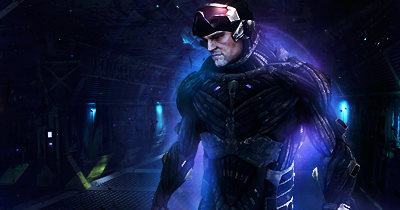
Hmm.. I think maybe that the sig needs to have less of a contrast cos it cuts my eyes a bit but its a good job still. I think you should clip mask or something on negative spaces of the sig. I love the smudging, it's awesome.
Edit: Oh, and ease up on those c4ds, cos it looks abit messy with it.


 Reply With Quote