0 members and 527 guests
No Members online

» Site Navigation
» Stats
Members: 35,442
Threads: 103,075
Posts: 826,688
Top Poster: cc.RadillacVIII (7,429)
|
-
The Great Knight

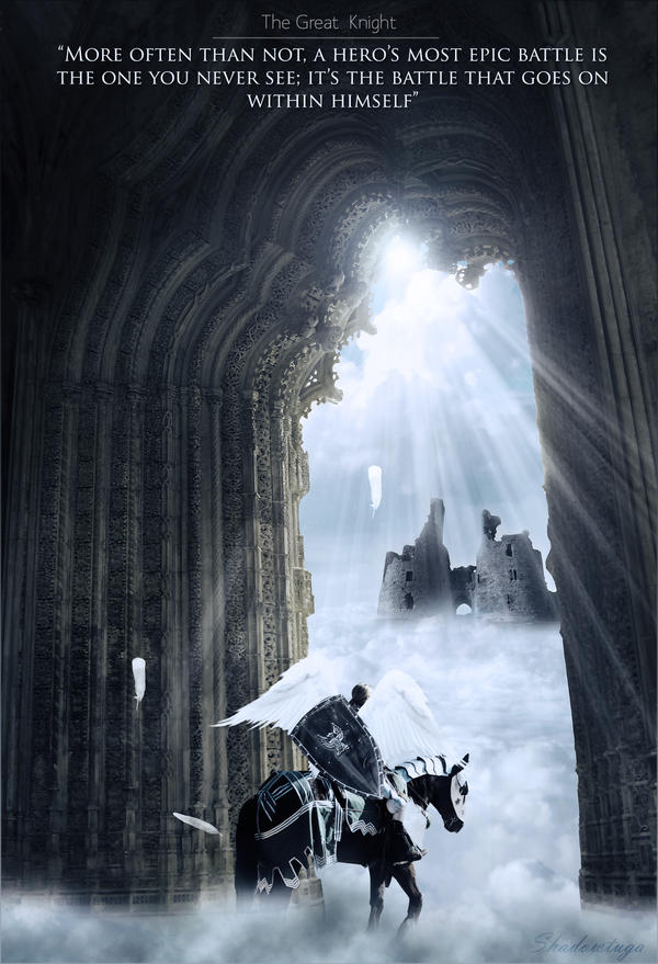
I follow some parts of a tutorial for this one but I had some extra effects, other elements, change the light source and some other things.
I love the outcome, i think i'm getting better in LP.
CnC?
-
damn that is amazing, can't find anything wrong with it, except possibly the lighting at top could use a little refining it looks good, just right at the very top of the lighting where the bright spot starts and the arch meet, right in that little spot it looks weird, lol, also not sure if the ruins in the bg are neccesary, it kinda distracts from the main character, maybe blur it slightly so its more of a bg image than a standout image. its great lp tho nice job.
-
I agree with DOMINO this looks amazing. I love the top messge too, suits this piece well. Nice job.
-
its really good
i like it
although the position of the guy with horse should have been better
and the rays should be cut or low opacitized xD
its relaly good overall i like it
Fur's Gift BOOOO EVERYONE

-
Thanks guys
Similar Threads
-
By Godden in forum Sigs & Manips
Replies: 7
Last Post: 09-28-2007, 01:14 PM
-
By YellowSubmarine in forum Digital Art
Replies: 9
Last Post: 02-03-2006, 09:29 AM
-
By Mr. Kenny in forum Digital Art
Replies: 22
Last Post: 01-26-2006, 04:02 PM
Posting Permissions
- You may not post new threads
- You may not post replies
- You may not post attachments
- You may not edit your posts
-
Forum Rules
|