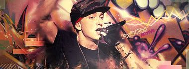
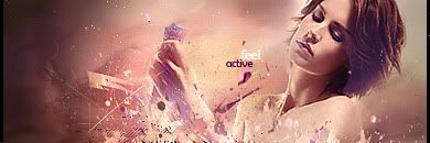
Okay, the blurred BG is alright, brings out the render i suppose.
THe lighting is quite good actually.
I think the sig is too high.
The effects are subtle, but neat. Maybe a bit more could have been done, but its nice atm.
Text is okayy. But i wouldn't choose 2 similar fonts, I would change the second text to something different, makes it more interesting.
I prefer V1, but I think it could be gradient mapped a bit more, to bring all the colours together.
Cute + Simple overall.


 Reply With Quote