0 members and 620 guests
No Members online

» Site Navigation

» Stats

Members: 35,442
Threads: 103,075
Posts: 826,688
Top Poster: cc.RadillacVIII (7,429)
|
-
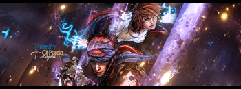
 Different style PoP 4 sig Different style PoP 4 sig

Hell of a lot of smudging, distortion filters, grad maps, clip makes, blurring and other stuff. If it isn't really noticeable, I put the light source at the bottom right corner.
Cnc please 
-

I kind of like this. I feel that the effects are good and the smudging is on and your render placement is pretty much there. The only thing I don't like is the random rectangle of lines and the text tucked away in the corners. Good job overall. 
-

TExt sux. And the scanlines need removal. The colours are nice but I don't feel any depth at all, or flow. The effects are probably because of the focal? If not, good stuff. I like the pen tooling you did. A neat job, just some useless stuff added.
 Originally Posted by Slave
takken, you sweet boy you, i could eat you 6^
-

Imo this looks good. remove the clipping mask of his face and drop the text in the upper left.
Looks nice
Similar Threads
-
By Karter in forum Sigs & Manips
Replies: 7
Last Post: 06-23-2009, 03:27 AM
-
By SpYdaBoi in forum Sigs & Manips
Replies: 2
Last Post: 06-26-2008, 10:41 AM
-
By SpYdaBoi in forum Sigs & Manips
Replies: 5
Last Post: 06-14-2008, 07:55 PM
-
By SpYdaBoi in forum Sigs & Manips
Replies: 3
Last Post: 06-10-2008, 06:28 PM
-
By Ben in forum Sigs & Manips
Replies: 5
Last Post: 03-03-2006, 12:35 PM
 Posting Permissions
- You may not post new threads
- You may not post replies
- You may not post attachments
- You may not edit your posts
-
Forum Rules
|


