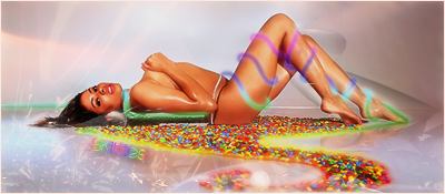
Use your basic fonts sans serif or arial.And make your fonts smaller and still closer to your focal.. i keep mine around between 8-12 pxls. you dont want to distract the main picture with your font.. #2 your blending is getting better but a bit obvious.. maybey smudge a bit more .#3 your right side is a bit dark maybe brighten it up a little.. #4 Your sig is a bit to sharpened dont over do it or you get a really bad pixelated render like you see in the hair..Maybe put your render on the right side off center.. But your overall achivement is getting better. Just need to touch up a few areas. Good job!!


 Reply With Quote