0 members and 16,908 guests
No Members online

» Site Navigation

» Stats
Members: 35,442
Threads: 103,075
Posts: 826,688
Top Poster: cc.RadillacVIII (7,429)
|
-
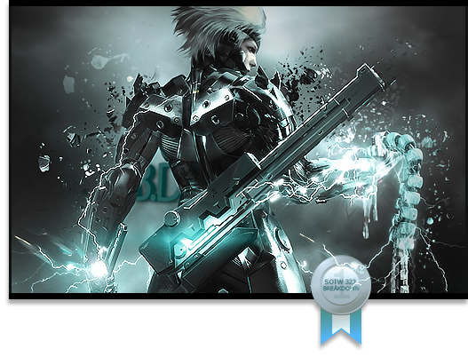
 Spidey Sig Spidey Sig
-
Wow, definitely one of the best spidey signatures, since they'res so many.
Just one thing on his leg the circle, and the light source seems to much like brushing.
-
Its over sharpened you can fix that by going to edit>fade sharpen. Otherwise nice sig and nice use of lighting but it doesnt work well on the black and white ones.
I made one just like yours a while back I wonder whose is better.


My Three Rules Of Making a Sig Flow, Lighting and Depth
-
I like it a lot! Clear, neat nice depth I like it, I think it could use more effects
 I need less friends, more bread. Less talk, more head.
Battle Record 5-1
-
-
@Shorter
Nice. Nice effects, good blending, good depth. Maybe work a little bit with the text.
@DR809
It looks nice. But kinda boring. Add more effects to it. and move the text out of the corner.
-
Similar Threads
-
By s0ggywaffls in forum Signature Tutorials
Replies: 4
Last Post: 04-05-2011, 04:27 AM
-
By Lew in forum Sigs & Manips
Replies: 4
Last Post: 04-25-2008, 06:45 PM
-
By ~FireTap in forum Digital Art
Replies: 3
Last Post: 07-25-2005, 06:14 PM
-
By ~FireTap in forum Digital Art
Replies: 16
Last Post: 06-29-2005, 07:21 PM
-
By Magnum in forum Digital Art
Replies: 13
Last Post: 06-22-2005, 11:56 PM
 Posting Permissions
- You may not post new threads
- You may not post replies
- You may not post attachments
- You may not edit your posts
-
Forum Rules
|


 Reply With Quote