GFXVoid Graphic Design Forum

Remove Text Formatting
Loading...

» Online Users: 3,393

0 members and 3,393 guests
No Members online

» Site Navigation

 > FAQ

» Stats

Members: 35,442
Threads: 103,075
Posts: 826,688
Top Poster: cc.RadillacVIII (7,429)
Welcome to our newest member, Lekelindids
Results 1 to 8 of 8

Thread: Dark Knight

  1. #1
    Join Date
    Jul 2009
    Location
    BC, Canada
    Posts
    450

    Default Dark Knight

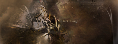
    CnC please. Be hard on this one..I need to know what im doing wrong.. Maybe some helpful tips on making it better..


  2. #2
    Join Date
    Jul 2009
    Location
    Brooklyn, New York
    Posts
    1,604

    Default

    Try not to smudge the face,main focal, into the background. The whole left of the focal is empty. The render is also kinda LQ. Could use some work but if you fix the short comings it'd be great. Nice smudging BTW

    My Three Rules Of Making a Sig Flow, Lighting and Depth


  3. #3
    Join Date
    Jul 2009
    Location
    BC, Canada
    Posts
    450

    Default

    The settings i use i think sometimes i over smudge when blending,.i know i messed up on the focal i over erased a bit.. The render is actually good its just what i did when smudging and blending might of ruined it..i did alot of layering on him.. so could be the reason for it.. Tx for the tip..


  4. #4
    Join Date
    Aug 2009
    Posts
    273

    Default

    I think you over dampened the render. Try sharpening the edges a bit, you can use shadows to move him to the background without losing focus on the render. It just takes some finesse. Using effects will make the shadows look real without pushing it into 2D.


  5. #5
    Join Date
    Feb 2009
    Location
    Portsmouth
    Posts
    2,970

    Default

    I think it's too dark. There's no light source so that'd be a good start.
    Render is over-blended, there's no flow although your smudging is good.
    Text again is bad but like I always say it's hardest part of a tag most of the time.
    Are you using C4D's?
    Read up some more tutorials, you'll get there. I did.

  6. #6
    Join Date
    Jul 2009
    Location
    BC, Canada
    Posts
    450

    Default

    Some c4ds but nothing great that i can use i have to find some more packs to Dl.. Ty for the input..


  7. #7
    Join Date
    Jul 2009
    Location
    Littleton, CO
    Posts
    174

    Default

    The blending is good, but you smudged the face too much and the edges of the render need to be blurred or something. It needs a light source and you need to give it a some more depth. Nice try though.
    ...::Favorite::...


    ...::SOTW 180 Entry::...


    "Even the smallest of things can make the biggest difference."


    DeviantART: DiabloUNDERWRLD
    Art Blog: Click Here

  8. #8
    Join Date
    Jul 2009
    Posts
    383

    Default

    here i love to use colors not just to dark colors thats just me and yah like they were saying try not to smudge the focal so much just enough to blend it and try using a better light source i cant really see any and since its a dark sig u need one but great job

Similar Threads

  1. [Showcase] Dark Knight
    By NoFeaR in forum Sigs & Manips
    Replies: 7
    Last Post: 06-26-2009, 12:08 AM
  2. The Dark Knight.
    By ratchetnclank in forum Sigs & Manips
    Replies: 5
    Last Post: 12-12-2008, 08:31 PM
  3. Dark Knight
    By Immortal. in forum Sigs & Manips
    Replies: 7
    Last Post: 07-24-2008, 02:19 PM
  4. Joker sig (The Dark Knight)
    By Joost in forum Sigs & Manips
    Replies: 3
    Last Post: 06-14-2008, 09:42 AM
  5. Dark Knight
    By Sp!t in forum Sigs & Manips
    Replies: 7
    Last Post: 09-02-2007, 04:52 PM

Posting Permissions

  • You may not post new threads
  • You may not post replies
  • You may not post attachments
  • You may not edit your posts
  •  
Powered by vBadvanced CMPS v4.1.1