0 members and 787 guests
No Members online

» Site Navigation

» Stats
Members: 35,442
Threads: 103,075
Posts: 826,688
Top Poster: cc.RadillacVIII (7,429)
|
-
 kinda new... kinda new...
-
-
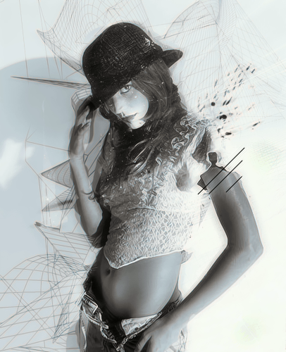
Patience is a Virtue, Please dont bump your work, pple will respond when they have something beneficial to add. I like these pieces the text one is good, could use some work on ur blending, but not bad overall. first one is cool looks like a plastic woman. second is cluttered and random. text one just has plain bg, not much goin on but text looks good.
-
 Originally Posted by Eyedeology

no one??????
Like what Domino said, there are some people that aren't always online. These people can be working, sleeping or just busy.
All double posting really does is push other's work down the forum page so that they may think of bumping their own thread, and it may turn people away from commenting.
__________________
You don't have much flow in your work at the moment. The Wireframe C4Ds add a nice effect but they do make the image look messy.
I also think the colours are a bit too monotone for my liking, but this could be improved by some effects in the background.
The last image looks good, but it doesn't have a huge amount to draw the attention of people. The only added effect outside the letters is the pen tool line. You should experiment with some other effects and try to create a more exciting image. 
Similar Threads
-
By HellBringer in forum Other Tutorials
Replies: 7
Last Post: 06-05-2006, 12:52 AM
-
By Freak in forum Sigs & Manips
Replies: 2
Last Post: 02-10-2006, 07:22 PM
-
By BustA in forum Digital Art
Replies: 11
Last Post: 02-01-2006, 05:38 PM
-
By STERLING in forum Digital Art
Replies: 2
Last Post: 01-24-2006, 06:36 PM
-
By White BM in forum Digital Art
Replies: 4
Last Post: 06-03-2005, 11:12 AM
 Posting Permissions
- You may not post new threads
- You may not post replies
- You may not post attachments
- You may not edit your posts
-
Forum Rules
|


 Reply With Quote