0 members and 645 guests
No Members online

» Site Navigation

» Stats
Members: 35,442
Threads: 103,075
Posts: 826,688
Top Poster: cc.RadillacVIII (7,429)
|
-
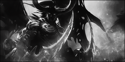
 Spiderman sig Spiderman sig

ima not that gud yet but plz give me tips and advice thanks!!!
-
The first thing that stands out is the Font. It's way to out there for this style of signature.
The signature itself is pretty awesome and you have some great effects, but I would remove the glow, move the text a bit to the left and choose a different font.
You can download additional fonts from here: [Link]
-
the sig is too long...bec of that u had a hard time filling the space...choose a smaller canvas to work on...there is no definite flow and depth...with flow, it means u should have a specific direction/flow of your effects...the render is blurred badly... with depth, refer to the sig of nutter just below u (the code geass lelouch) it makes u feel that a hand is reaching out to you and not just a flat sig.
off topic: nutter - wow that sig is awesome, can u share to me the render u used on that one?
My Latest Work:
-
you can improve the text add some light
and also the colour of spidey
NEW: FAV: When it comes to GFX,I always put effort on it
Similar Threads
-
By Bailey in forum Sigs & Manips
Replies: 1
Last Post: 09-03-2009, 04:45 PM
-
By AntiEmperor in forum Sigs & Manips
Replies: 0
Last Post: 08-03-2008, 06:29 PM
-
By DeadlyShadow in forum Sigs & Manips
Replies: 3
Last Post: 08-03-2008, 03:49 PM
-
By Smiling Demon in forum Sigs & Manips
Replies: 11
Last Post: 05-13-2007, 02:55 PM
-
By Chucks in forum The Void
Replies: 11
Last Post: 05-10-2007, 11:34 PM
 Posting Permissions
- You may not post new threads
- You may not post replies
- You may not post attachments
- You may not edit your posts
-
Forum Rules
|


 Reply With Quote


