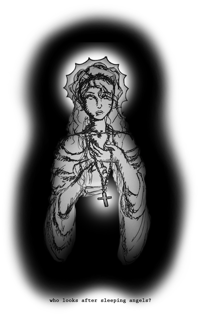
i like the bluer ones, the other ones feel little like theres just a bit too much saturation. for me, the lighter blues make it feel cleaner and newer almost. i love the cleaness of this sig, theres not to much fading and stuff and it still looks great. the only thing i have to say about improvement, is that i lose track of her body when i look away from her face, maybe its just the render being confusing or something, maybe its cause i'm feverish and tired... idk xD but good job


 Reply With Quote