0 members and 1,512 guests
No Members online

» Site Navigation

» Stats
Members: 35,442
Threads: 103,075
Posts: 826,688
Top Poster: cc.RadillacVIII (7,429)
|
-
09-27-2009, 03:15 PM
#3321

So plain. 4/10. Where's all your good tags?
-
09-27-2009, 03:21 PM
#3322
thats my latest 1, ive been pretty busy with college, so no time to make 1, ill make 1 eventually 
7/10 for u, i like the focal of your tag, very different, but idk, somethin is pissin me off about the tag lol, maybe its the bg color or content
In all deepest reality, we may only imagine the days past us, knowing that anything and all happens; and time will never be written until the happening... The future is 'eXcellence'.
eXx
-
09-27-2009, 03:24 PM
#3323
Top - 5/10, too plain. Border may help?
Bottom - 7/10, it may not be a signaturebut I
like it nonetheless
-
09-27-2009, 03:37 PM
#3324
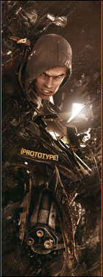
get rid of the lighting around the guy and to tall for my liking 6/10
-
09-27-2009, 04:00 PM
#3325
the colour balance is great, especially for keeping a single colour theme going. the border cuts off way too much of his head, and he's too far over to the left, it leaves way too much empty space where the focus object should be. i love the way you have the focus object fit in with the background, and the text looks great too. good job :P 7/10
-
09-27-2009, 04:12 PM
#3326
Pretty plain bro 4/10
you use Illustrator but still
-
10-01-2009, 05:52 AM
#3327
+ves = Like the flow and colors.
-ves = font and the border with drop shadow effect.
6/10
Latest:

Favorite:
-
10-01-2009, 06:08 AM
#3328
top - 5/10.. plain ;3
bottom - 6/10.. to messy, focal is lost in everything :3
-
10-01-2009, 07:31 AM
#3329
-
10-01-2009, 08:40 AM
#3330
Like 2nd one .... nice effects 6/10
Similar Threads
-
By SgtSwabs in forum The Void
Replies: 16
Last Post: 12-06-2005, 08:42 PM
-
By LunarPoet in forum Sigs & Manips
Replies: 1
Last Post: 06-23-2005, 12:31 PM
-
By Xavier in forum Sigs & Manips
Replies: 8
Last Post: 06-03-2005, 01:46 AM
 Posting Permissions
- You may not post new threads
- You may not post replies
- You may not post attachments
- You may not edit your posts
-
Forum Rules
|


 Reply With Quote


