0 members and 703 guests
No Members online

» Site Navigation

» Stats
Members: 35,442
Threads: 103,075
Posts: 826,688
Top Poster: cc.RadillacVIII (7,429)
|
-
 solitary confinement solitary confinement
my friend thinks i should call this 'i want a friend; i need a fiend' but i think thats too long to put in the title box o.o
anywas so here it is:
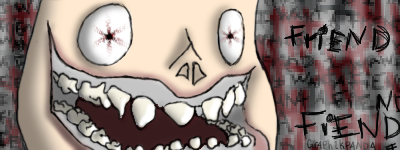
i drew it on a bus ride, back from a softball game, (needless to say, it was on one of the many short buses my school has... for unknown reasons) so yeah
c&c pweez? ^.^
-
(this is a bump) [part of my school just got burned down and it was arson. :'(]
i guess no one wants to reply.... awww
wow no one will reply.... does that mean this is REALLY bad?? :'(
Last edited by Nutter; 10-04-2009 at 06:51 PM.
Reason: Merged Post
-
I'll save you P4ND4!!
I like the simple sketch, but it would be cooler if you had a more realistic look.
The random text is pretty cool too.
-
awww yay ^.^ thanks for replying i love you nowwwww 
ok more realistic. i'll work on that... i think i'll prolly fail but i'll work on it anyways
-
i lold when i saw this!! it's realy funny! The drawing is like slapped on the bg to much imo. maybe if you blended it a bit??
-
 Originally Posted by Xelo

i lold when i saw this!! it's realy funny! The drawing is like slapped on the bg to much imo. maybe if you blended it a bit??
you told me? o.0 where? what?
the reason it looks that way is cause i like strait out drawing my crap, like all the outlines and words are on a single layer, and for some reason when i was working on it, i combined the colour layer and the outline layer somewhere along the way, and when i saved it i couldnt revert it. so basically if i had blended it would be like two lines of blendiness around the guys head xD
-
The drawing itself is very good, I think that it could do with alot more detail and more human like features.
I'm not a big fan of the background though. It's messy, chaotic and it brings the feel of the signature down.
The text is good. I do think it's a bit sketchy when you compare it to the drawing. Your drawing has some nice clean lines, and each letter on the text has several.
Keep it up, I like these hand drawn sigs.
-
Originally Posted by Nutter
The drawing itself is very good, I think that it could do with alot more detail and more human like features.
I'm not a big fan of the background though. It's messy, chaotic and it brings the feel of the signature down.
The text is good. I do think it's a bit sketchy when you compare it to the drawing. Your drawing has some nice clean lines, and each letter on the text has several.
Keep it up, I like these hand drawn sigs.
thanks, the reason the text looks sketchy is cause i wanted it to look like the character drew it, plus i drew it while i was in the back of a bus on a softball trip, plus thats kinda my natural handwriting, its the same in the signature i've got as my default... thanks for the cnc ^.^
Last edited by gr4ph1kP4ND4; 10-04-2009 at 09:01 PM.
-
the reason i keep bumping this is cause i need some critique on my work, cause i havent been getting as much as i normally would if i were taking an art class at school, but i cant because my required classes take up my whole day, and i literally have no after school time, what with softball and homework. sorry if my bumping is annoying to anyone :P
Similar Threads
-
By robgasm in forum Digital Art
Replies: 6
Last Post: 05-26-2006, 01:05 AM
 Posting Permissions
- You may not post new threads
- You may not post replies
- You may not post attachments
- You may not edit your posts
-
Forum Rules
|


 Reply With Quote


