0 members and 1,421 guests
No Members online

» Site Navigation

» Stats

Members: 35,442
Threads: 103,075
Posts: 826,688
Top Poster: cc.RadillacVIII (7,429)
|
-
-

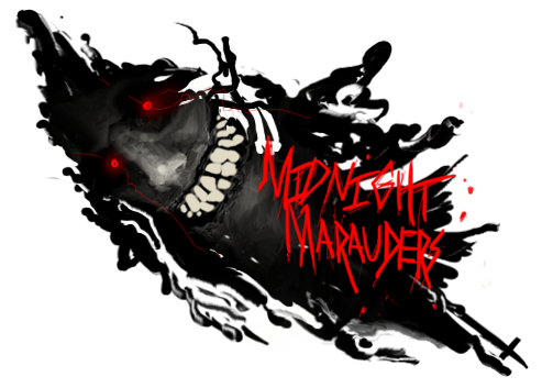
thx ion, but just so you know, constructive criticism isn't tearing something to shreds and pointing out all of its flaws. Its pointing out things the artist can improve on, and telling them how to improve on it.
On that note-- if the border isnt good, what do you suggest? if the text needs work, give me some advice.
I appreciate you CnCing because you always point out something that i didn't see, but the criticism is not constructive, if anything, its destructive.
-

I disagree. If it's not good, do something else. Almost all of critique is telling people what they did wrong. That way they can improve. Telling you what to do would be destructive. It's art. You have to figure it out for yourself. It is always constructive if I point out something you didn't see because then you'll look for it next time and hopefully not make the same mistake, or at least not do the exact same thing again and think it's o.k. I'd point out good things, but from that list and looking at the tag I can't find much that I'd feel comfortable complimenting. Maybe next time. Improve on those things and I'll probably have something.
For the record:
Boarder doesn't look good is code for "no boarder"
Text is bad: font and placement are off is code for "change the placement and font"
-

Just telling me what i did wrong isn't going to fix anything. Next time i might not put the text in a different location, or use a different font, but that doesn't mean i will be improving. The purpose of CnCing is to help others improve; just telling them what they did wrong doesn't help them to do it better, just different.
For the record:
There is a boarder...
Telling me to "change the placement and font" dosnt help me improve
-

Honestly I would have to pretty much disagree with everything Aion said....There really isnt anything wron with this..Maybe the text is a little too strong but other than that not much. I dont get why everyone hates monotoned....It really doesnt look that bad if you can pull it off like this where there is still other color, but not over whelming amounts. I mean you have a a clear focal that gives blance to the sig...one side isnt over whelming..I dont really get what hes saying
-

 Originally Posted by (-)Ion

I disagree. If it's not good, do something else. Almost all of critique is telling people what they did wrong. That way they can improve. Telling you what to do would be destructive. It's art. You have to figure it out for yourself. It is always constructive if I point out something you didn't see because then you'll look for it next time and hopefully not make the same mistake, or at least not do the exact same thing again and think it's o.k. I'd point out good things, but from that list and looking at the tag I can't find much that I'd feel comfortable complimenting. Maybe next time. Improve on those things and I'll probably have something.
For the record:
Boarder doesn't look good is code for "no boarder"
Text is bad: font and placement are off is code for "change the placement and font"
K, let me swoop in here and straighten a few arrows. Critique isn't about telling people what they did wrong. Critique isn't about finding the flaws in everything. Constructive critique allows people to share experience; to suggest alternative ways of thinking. Constructive criticism helps people to avoid functional fixedness. It's not about saying "this sucks, that sucks, and everything here sucks". The way you present your critique has everything to do with being courteous to the original author.
Telling someone that something sucks isn't code for "take it off". It's not even code. Constructive critique provides balances for artists. Art is a very finicky thing, and even though there are alot of guides and systems that prove systematically that one way is better than another, there is still a massive creative void.
You owe it to the person you're critiquing to compliment your critique with some suggestive advice. Saying what's wrong isn't constructive. It's not being a nazi, it's not being overly kind. It's common courtesy. Critique the art, and if you don't like a certain area, explain why and provide suggestions for alternative directions.
Saying "change the placement" is like saying "make something else". It provides no direction. "Change the font" no direction. Oblivious and empty critique. You're basically begging the question if you consider that to be constructive.
If you can't provide something meaningful, then people will stop giving you the time of day and your critique will lose its merit.
Last edited by Chris; 11-04-2009 at 04:49 PM.
-
Similar Threads
-
By Immortal. in forum Sigs & Manips
Replies: 6
Last Post: 05-18-2009, 10:32 AM
-
By Fuzer in forum Sigs & Manips
Replies: 7
Last Post: 04-05-2009, 07:17 AM
-
By Splendid in forum Sigs & Manips
Replies: 2
Last Post: 03-06-2008, 10:38 AM
-
By Acario in forum Sigs & Manips
Replies: 4
Last Post: 08-10-2005, 11:38 AM
-
By 33rd[SS]Rec.Viva in forum Digital Art
Replies: 0
Last Post: 07-25-2005, 05:43 PM
 Posting Permissions
- You may not post new threads
- You may not post replies
- You may not post attachments
- You may not edit your posts
-
Forum Rules
|


 Reply With Quote


