


My two latest pieces of work, haven't made to much lately but been playing MW2 lots so I made a sig on it.
This sig won the showcase a while back on the EAUK forums.
|
|


Loading...
|
» Online Users: 12,895
|
Results 1 to 3 of 3
Thread: Soap MacTavish " Orichimaru
Similar Threads
|


 Reply With Quote


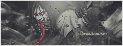
 Yea, tried to add depth by sharpening the render but blurring the background. Thanks.