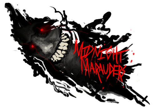
-good text placement, but i think the color needs to be alittle lighter, or maybe put a lighter green to darker green grad map over it.
-its needs alittle more, some more c4ds, and less smudging.
-smudging is too strong, i would erase some parts
-lighting is alittle strong and looks forced. Instead of just a 100 px soft brush, try doing a couple of different lighting layers with some different opacity's. Then work with burn/dodge tool.
hope this helps, great work dom


 Reply With Quote