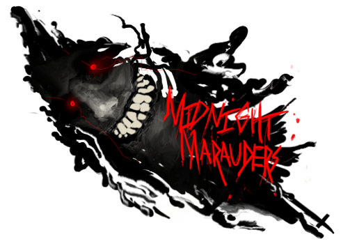
not bad, but i'm not really feeling this.
-the c4d colors are too bold and they are too sharp. this is slightly corrected in the B/W version
-you have no real lighting source, you need to look at your render and see where you think the lighting is coming from.
-you do not have enough going on, there is a lot of negative space. it seems that there is 4 c4ds, you render, and some simple smudging. you need to add some more c4ds around the render to help add to you flow and effects. also try working with some filters and clipping masks.
-it looks as if you tried to create some depth on the left side of the sig, but its not really getting the job done. I would suggest getting a nice background stock (maybe of a video game screen shot, i think that would fit well here) and blurring it a bit.
- the text needs to be moved closer to the render (rule of thirds)
hope this helps


 Reply With Quote