GFXVoid Graphic Design Forum

Remove Text Formatting
Loading...

» Online Users: 10,164

0 members and 10,164 guests
No Members online

» Site Navigation

 > FAQ

» Stats

Members: 35,442
Threads: 103,075
Posts: 826,688
Top Poster: cc.RadillacVIII (7,429)
Welcome to our newest member, Lekelindids
Page 351 of 496 FirstFirst ... 251301341349350351352353361401451 ... LastLast
Results 3,501 to 3,510 of 4959
  1. #3501
    Join Date
    Jul 2009
    Posts
    245

    Default

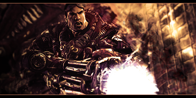
    8/10 depth is really nice however its monotone and the bright spot on the gun is distracting

  2. #3502
    Join Date
    Dec 2009
    Location
    Poprad, Slovakia
    Posts
    90

    Default

    10/10 The background + effets are really awesome. (One of the best i've seen for a while)

    8/10 The text is average it could stand out more, his tuxedo look like snow (i don't like it) and his face is a little bit light, but i like the whole idea.


  3. #3503
    Join Date
    Jul 2009
    Posts
    245

    Default

    5/10 effects and render look lq and light source is acting as a second focal.
    4/10 really messy and the text needs work

  4. #3504
    Join Date
    Apr 2009
    Location
    Somewhere in the Middle
    Posts
    467

    Default

    9/10 nice gift
    8/10 nice composition pande, u cud add some bubble c4d i think but still tag looking great. NF

  5. #3505
    Join Date
    Sep 2008
    Posts
    1,589

    Default

    10/10 very very cool almost graffiti esk

  6. #3506
    Join Date
    Jul 2009
    Location
    Holland
    Posts
    24

    Default

    wel.... i like the whole idea and how u did it, but its a little simple looking... not really my taste so 6/10

  7. #3507
    Join Date
    Oct 2009
    Posts
    26

    Default

    7/10 very nice but c4d's seem to be a bit too randomly placed

  8. #3508
    Join Date
    Jul 2009
    Location
    Holland
    Posts
    24

    Default

    wow i really like this one especially the fading effect the only thing i can think about is that the text nees some work, so 8.5/10

  9. #3509
    Join Date
    Apr 2008
    Location
    Sweden
    Posts
    7,429

    Default

    The bg doesn't work with the render. The render needs blending. The c4d effects is just thrown in without any feeling, it's just there. Text is bad.

    Since u got a high tech render I would go for a tech sig, so redo it all now

    3/10


  10. #3510

    Default

    10/10 (your sig)

    My goal is to make something equal or better than that

Similar Threads

  1. Rate The Sig Above!
    By SgtSwabs in forum The Void
    Replies: 16
    Last Post: 12-06-2005, 08:42 PM
  2. *NEW* Rate Avatar? Rate Sig?
    By LunarPoet in forum Sigs & Manips
    Replies: 1
    Last Post: 06-23-2005, 12:31 PM
  3. Rate my Signature...
    By Xavier in forum Sigs & Manips
    Replies: 8
    Last Post: 06-03-2005, 01:46 AM

Posting Permissions

  • You may not post new threads
  • You may not post replies
  • You may not post attachments
  • You may not edit your posts
  •  
Powered by vBadvanced CMPS v4.1.1