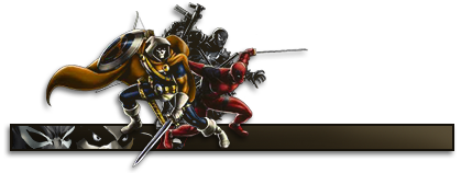
You need to blend in the renders more, now it only looks like a bad cut on the left guy.
Yeah the EAsports logo looks like a bad cut, chopped circle lines.
I also noticed a red line at the left on the white text box
Keep polishing on it, you got a nice concept.


 Reply With Quote