0 members and 3,175 guests
No Members online

» Site Navigation

» Stats

Members: 35,442
Threads: 103,075
Posts: 826,688
Top Poster: cc.RadillacVIII (7,429)
|
-
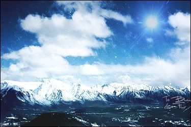
 Above the clouds Above the clouds
Im currently working on manipulative pieces and creativity in my work. I've been having alot of problems with finding ideas for manips so i spent like 3 days thinking of what to do on this. Personally don't like the outcome of this very much. What do you guys think?

-

The brush work and c4d in the upper right corner doesn't connect with the rest of the pic and the position of the text kinda blocks the natural flow there...maybe put it higher?
looks good so far
-
-

hmm, don't really see why the c4d's are like that in the top right corner
i think if you'd remove that, it would be great
GJ
WHAT'S THIS?! A SIGNATURE?
-

lemme give you some advice
1) never use c4d's as a tool in this type of manipulations. I tell you why
your theme here is above the clouds and as per ur stocks, its a still life l, what purpose does c4d serve? think.
2) when you make an lp, make sure the text dont acquire the focal point.
No doubt c4d manipulations are great too but they need to be put in with sense, what you did here is place them somewhere because you wanted to place them. It was your internal feeling to use c4d's because you had been making tags for a while now and you have a habit. But you know what, tags, and lps have different purpose, portrayed differently, have different meanings, and have different process. The most important of it all They have different sizes.
Another thing is that, check first what you want to portray more. The clouds or the model or the castle. Depending on that you make predictions of placements. I will something nice. Try with simpler manipulations with just 1 subject for now. Even i am doing the same atm, you can chk out my lp's and you will find almost single subject art's. I am developing myself so that i can do better with more than 1 subjects. Honestly from my experience i am telling you that you cant directly jump on these type of manips. I tried and failed miserably. Tell me are you happy with this?
I hope you take my advice as a critique and not that i am trying to make you feel something else 
If you just tip off here and there these can be fantastic scene. Work on blending and try to make the subject more admirable. I actually, critisized but, like the placements well. Work on it more. dont leave it 
Nice if its ur first though 
Fur's Gift BOOOO EVERYONE

-

thanks. it's my second manip and i don't like this one very much at all (Mainly because of the c4ds) This is because my ideas suck right now and wanted to fill the canvas more. Thanks for commnts. I will simplify my designs for now 
-

-I'd be getting rid of the text, or sticking it at the bottom.
-Adding a nice thick white border to the whole image.
-Blending the moon / planet in a little better ( and why's half a moon over the housee!!  Shrink it down and stick it on the left! A buildup of minor details looks better than a buildup of loads and loads of ideas at once!! ) Shrink it down and stick it on the left! A buildup of minor details looks better than a buildup of loads and loads of ideas at once!! )
-Maybe sharpening up the stock image of the manor, or even adding to it to make a more dramatic setting, we are in the clouds after all!
-If you have the ability to place the abstract stuff in amongst the clouds between her and the house ( use of perspective , lighting on the clouds ) popping in and out, it would look awesome. That's about the only way I can see it in this image effectively though!
I seem to have written a bit of an essay, sorry! It's a well executed piece, just a little more thought into the composition would have it looking nice and refined, or proffessional!
-

It's pretty nice, but the effects in the upper right corner really sort of "mess up" the simplicity and serenity of this piece.
Latest:

-

kk thanks guys. yh the effects suck 
-

The effects seem rather random in the piece, try and get some flow to it. Work on the contrast aswell, the colours seem very similar and not very exciting.
Similar Threads
-
By .Innovation in forum Sigs & Manips
Replies: 9
Last Post: 07-21-2009, 11:14 AM
-
By Linc in forum Digital Art
Replies: 2
Last Post: 11-29-2008, 08:27 AM
-
By xlevix in forum Digital Art
Replies: 8
Last Post: 12-17-2005, 05:54 PM
-
By Freak in forum Sigs & Manips
Replies: 6
Last Post: 11-20-2005, 06:47 PM
-
By Nightfire in forum Sigs & Manips
Replies: 10
Last Post: 02-17-2005, 02:17 PM
 Posting Permissions
- You may not post new threads
- You may not post replies
- You may not post attachments
- You may not edit your posts
-
Forum Rules
|


 Reply With Quote


 Shrink it down and stick it on the left! A buildup of minor details looks better than a buildup of loads and loads of ideas at once!! )


