0 members and 947 guests
No Members online

» Site Navigation

» Stats

Members: 35,442
Threads: 103,075
Posts: 826,688
Top Poster: cc.RadillacVIII (7,429)
|
-

 Originally Posted by KidBuu

1) If all those filters and things were crap they wouldnt be coming with the package of photoshop.
And i too believe in the saying "simplicity is the key to success", and that is why i just suggested gradients. Classical oldstyle wallpapers also contained extra elements of design like splattered letters and all. Old Bookman style font was most used in those days. I am not saying that you do the same.
But.. A movie wallpaper needs to be attractive, You have to either go with the trends or change them.

One of the most famous movie posters ever from one of the most famous designers ever. It's a trend that hasn't died out and still informs modern day design in movies:

It's no good you looking out there and saying 'That's the trend' when you've done no research into the history of said trend, or have no data on how the designer reached that particular consesus of design.
Hollywood movie posters are mostly bullshit. Any designer worth his salts will tell you this. They're designed specifically to draw people in to watch the film and put a lot of glossy elements in to draw in these people. They follow the basic principles of design, but add a tonne of unecessary elements just because, as you pointed out, people want to be wowed. And it's absolutely no good sitting there saying "well, that's how everyone else is doing it, so that's how it must be done" design doesn't work that way. If design did work that way we'd never have had people like David Carson and people would still be hand-painting 'commercial advertising'.
Design is about following yourself, not following the crowd. Otherwise all you're doing is regurgitating everyone else's ideas.
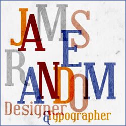
There's large scope for alternate styling out there, like this:
 Which is, quite simply, genius and well informed. Which is, quite simply, genius and well informed.
Or this:

Filters are there to be used, but not over-used. Primarily the filters are more for the purposes of photography than design (that is, after all, why it's called photoshop. Most designers I know and work with barely use photohop (I aint used it in a while myself), they use illustrator or (shock horror) a pencil!
Last edited by Soap; 02-07-2010 at 06:34 AM.
-

that made my work simple.
so you see, you need to add extra elements is what i wanted to show. Every one of the posters you displayed has elements that cover up the canvas or create a flow to look at the main subject. Thats what i wanted to point out.
Fur's Gift BOOOO EVERYONE

-

I see where you are coming from with the always stay sharp thing. I realise that I am young and I haven't been to school etc... Congratz, I now agree with you
" or (shock horror) a pencil!"
btw i use pencil
Last edited by Scrib; 02-07-2010 at 09:57 AM.
-

Your not the only person on this entire forum that has experience in art/design school. Honestly, your work its pretty good, some better than others, but your attitude ruins any chance I had of truly seeing your work purely as art. Instead of acting as if your better than everyone and constantly misdirecting ever ounce of criticism that comes your way, take it into consideration, who knows, you might find something useful or creative. You can downplay filters all you want, truth is, I rarely use them, but they are part of design, get use to it. As for illustrator "or (shock horror) a pencil!" I use both in most of my work, which is why I feel your underestimate the majority of people on this site.
As for your piece, I really think its good, and I love the simplicity. Its very well done.
-

and the skull doesn't even blend in to the planet.. mmm if this is supposed to be an idea ok, otherwise it needs a lot off work imo.
From scratch, just smudging the XL way
-

 Originally Posted by Xelo

and the skull doesn't even blend in to the moon.
Fixed that bit for you. Besides, I'm not sure what you're looking at but it blends perfectly to me...
Similar Threads
-
By asal in forum Sigs & Manips
Replies: 2
Last Post: 10-13-2008, 04:08 AM
-
By SpYdaBoi in forum Resources
Replies: 0
Last Post: 09-13-2008, 01:07 PM
-
By SJS91 in forum Digital Art
Replies: 7
Last Post: 01-24-2006, 12:31 PM
-
By `Kakashi in forum Resources
Replies: 0
Last Post: 12-18-2005, 04:53 PM
-
By JTF2Neo in forum Digital Art
Replies: 13
Last Post: 06-02-2005, 08:04 PM
 Posting Permissions
- You may not post new threads
- You may not post replies
- You may not post attachments
- You may not edit your posts
-
Forum Rules
|
Which is, quite simply, genius and well informed.


 Reply With Quote


