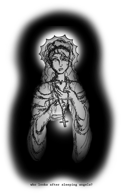
theres a certain extent to which i agree with scribbles, but i do think that theres a huge difference between creating a big picture and creating a sig. personally i think theres a lot more creativity going into an LP cause you've got so much more space to fill, but i do think that when doing an LP you should try to step out of the signature-style.
text: not my fave, although i have no room to talk cause A) i suck at text as most know and B) cause i dont really know what i'm talking about...
i agree the background doesnt fit the object of focus, but the colors work out very nicely.
did you make the background?
if you did i'll be amazed
if not i'll be disappointed. =\
sorry...
the background and the foreground are two different styles of art. the background is very soft, with a moonlit glow and a smooth eerie style, while the foreground is all hard lines, with a strong line of motion and a cut-out very defined quality to it. the background takes away too much from the foreground to really work all that well especially since the two styles are so different. if you're going to put two art styles into a single piece of art you've gotta make sure they blend like hell for it to work.
the fx were good just out of place
and the colors look great.
9/10
it looks good
just doesnt feel right (if ya get mah drift >.>)


 Reply With Quote