0 members and 26,370 guests
No Members online

» Site Navigation

» Stats
Members: 35,442
Threads: 103,075
Posts: 826,688
Top Poster: cc.RadillacVIII (7,429)
|
-
 HP5 HP5
Photos from a roll that's been sitting in my camera for over 3 months... I absolutely hate this film brand, I only remembered what film it was when I opened up the camera - I had been treating it like a roll of Tri-X 400. Anyway;
Praktica MTL 5 B
Ilford HP5+
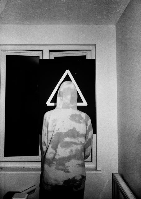
And this photo is for a small zine that someone on my course is curating; each issue is based around a different shape, the first issue based around the ever-ominous and trendy triangle. I based my image around clichéd 'cool' things so we have here a triangle, an anonymous self portrait from behind, and a quirky hoodie. All this combined with the image being taken using a roughly head on flash creates a rather 'hip' photograph that suits the 'hip' triangle shape:
-
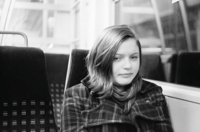
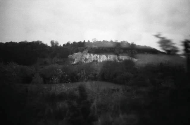
the 5th down picture, the downward look at the sidewalk, is awesome. the textures are amazing and i love the little details. My least favorite are the girl on the bus, it looks like you missed the focus a bit, and i also dislike the mountains, though the motion in it is cool. looks like you took it out a window which is pretty cool for this shot.
how did you get it so only the edge of the photo is noticeably motion blurred?
 My DevART
RATCHET is my bitch
Andrew says:
u ever stolen a bible?
Apathy says:
no
used the last two pages to roll a joint though
Andrew says:
wow
thats fucking hard core
^^HAHAHA, dm sucks XD
-
Yeah I did miss the focus on the first shot, trying to shoot wide open on a moving train at 1/15 is haaard :P That's no excuse though, I've handheld longer more difficult shots and kept them crisper... The one of the cliffs is shot through a car window while driving (which is why the focus is again off, can't focus and drive at the same time haha), good observation  the motion on the right is from trees lining the motorway in the foreground and just getting lucky with the positioning. I think if the shot was on colour film there would be a big difference between the tones and would make it much more obvious that it's closer than what it appears! the motion on the right is from trees lining the motorway in the foreground and just getting lucky with the positioning. I think if the shot was on colour film there would be a big difference between the tones and would make it much more obvious that it's closer than what it appears!
-
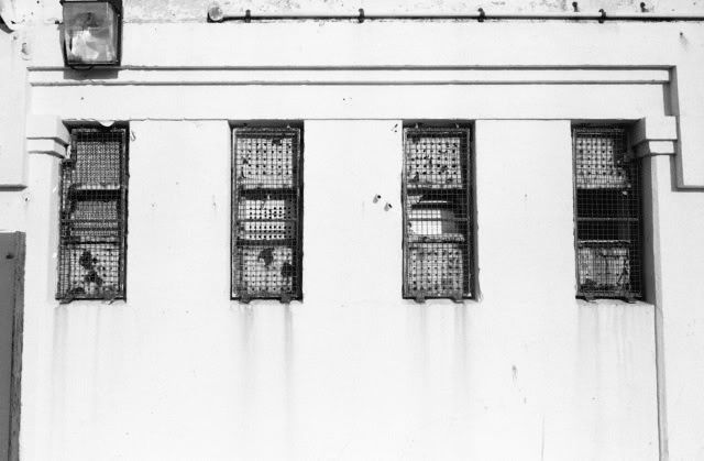
Dude, the picture of the four windows, I wish it was cropped in a little closer, but holllllyyyyy crap. Thats such a good symmetry shot. Kudos
 Posting Permissions
- You may not post new threads
- You may not post replies
- You may not post attachments
- You may not edit your posts
-
Forum Rules
|


 Reply With Quote

