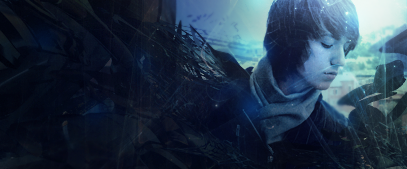
Pretty nice mate, Unlike the others, i dont think the left side is two empty, sometimes negative space adds to the focal, in this case, it does.
What i dont like is the effects on top of the render/stocks face. One rule of thumb that I (personally preference) try to do is to make sure nothing is on my renders face unless i have done it for a reason.
Other than that i think its great, love the simplicity.
Yeah you overdone it, you shouldn't try to directly copy someones work but should add something of your own to it as well prophet has his style and it's good but you need to come up with your own


 Reply With Quote


 :
:


 prophet has his style and it's good but you need to come up with your own

