0 members and 835 guests
No Members online

» Site Navigation
» Stats
Members: 35,442
Threads: 103,075
Posts: 826,688
Top Poster: cc.RadillacVIII (7,429)
|
-
03-24-2010, 05:32 AM
#3761
first one is too blurry and clouded, the text isnt good and it's too monotone. It's like you just covered it up with smoke.
5/10
second one the text is bad imo and the smudging doesnt make it blend it just looks out of place. more effects would be nice and a better bg.
6/10
-
03-24-2010, 06:01 AM
#3762
6/10.
A bit mono.
w8 i just commented on this. xD.
Face too bright.
-
03-25-2010, 09:43 PM
#3763
-
03-28-2010, 07:48 PM
#3764
8/10 Great job on the text and effects.. Looks very natural
-
04-01-2010, 06:55 AM
#3765
8/10
You should clip mask the text. IMO.
to me, you should use a white border for light sigs.
Black doesnt fit.
Other than that GJ on the sig.
-
04-01-2010, 01:33 PM
#3766
-
04-01-2010, 02:21 PM
#3767
#1: 8/10 - I love the render ( 
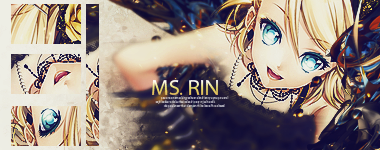
) I just feel that the transition between render and background goes a bit too fast around the leg area wich makes the entire dissapearing into the smudge look a bit "awkward", otherwise awsome.
#2: 9/10 - Just looks awsome tbh
-
04-01-2010, 02:23 PM
#3768
8.5/10 - Flow is awesome and so are effects. Maybe text and lighting could use some work but its still damn good
-
04-01-2010, 05:15 PM
#3769
7/10 Colors of the c4d/smudge look a bit messy.To bright on right side
8/10 LOVE THE SMUDGE! the c4d on his arm is Okk I lighting is to strong
-
04-03-2010, 03:15 AM
#3770
Similar Threads
-
By SgtSwabs in forum The Void
Replies: 16
Last Post: 12-06-2005, 08:42 PM
-
By LunarPoet in forum Sigs & Manips
Replies: 1
Last Post: 06-23-2005, 12:31 PM
-
By Xavier in forum Sigs & Manips
Replies: 8
Last Post: 06-03-2005, 01:46 AM
Posting Permissions
- You may not post new threads
- You may not post replies
- You may not post attachments
- You may not edit your posts
-
Forum Rules
|