0 members and 566 guests
No Members online

» Site Navigation

» Stats
Members: 35,442
Threads: 103,075
Posts: 826,688
Top Poster: cc.RadillacVIII (7,429)
|
-
-
-

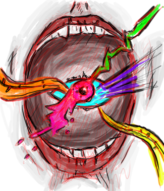
v1 for me and the text is a bit offsetting imo
-
it's cool, I like the V2 better, it's a bit sketchy but it works,maybe a little bit tweak to improve the depth and a lighting source. \thumbs
_ _ ________________________________________ _ _
◄ Wrath ▼ Pride ▼ Envy ▼ Lust ▼ Greed ▼ Sloth ▼ Gluttony ►
 Give a man a fish and he will eat for a day;
teach a man to fish and he will eat for a lifetime;
give a man a religion and he will die praying for a fish
-
Ehh...
V1 for me but the text is wierd
i find the entire tag messy and chaotic but thats just me
Keep at it
-
yeah i suck with text i admit im gona try a clipping mask on it next see how that looks and post v3 lol and i didnt like the 1st because i thought was too dark and i liked the colors more in v2
ty for the cnc all
-
nice sig bro. i like v1 better! i like the hatch style stuff in bg!
-
LOL , I'm the only who likes V2, the color used in V2 is much better imo
_ _ ________________________________________ _ _
◄ Wrath ▼ Pride ▼ Envy ▼ Lust ▼ Greed ▼ Sloth ▼ Gluttony ►
Give a man a fish and he will eat for a day;
teach a man to fish and he will eat for a lifetime;
give a man a religion and he will die praying for a fish
-
i like v1 more, but yea, the text is a bit off~
otherwise, its great!

I was watching Gundam (:
-
I like v2, the colors seem less drastic, and the text is a bit better imo, it is a bit chaotic but with a lil extra blending I think v2 could be awesome.
 Posting Permissions
- You may not post new threads
- You may not post replies
- You may not post attachments
- You may not edit your posts
-
Forum Rules
|


 Reply With Quote