0 members and 481 guests
No Members online

» Site Navigation

» Stats
Members: 35,442
Threads: 103,075
Posts: 826,688
Top Poster: cc.RadillacVIII (7,429)
|
-

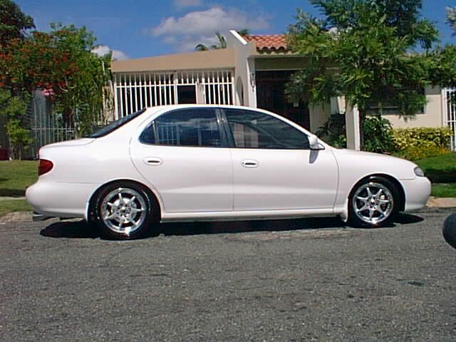
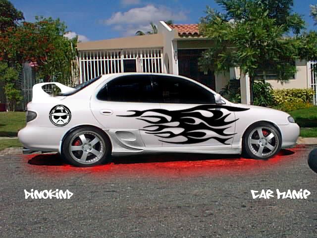
I know it aint the greatest but what u guys think
-
pretty cool, i love everything except for that face on that rear side panel, it doesnt look like its actually on the car like the flames do(the flames are awesome btw) and the wing looks like its halfway on the rear window... but other than that its pretty cool.
-
ahhh sum dude spray painted under that dudes car!!
serious, it doesnt look like neon - other than that its great, apart from the rims looking crummy and that face..
-
thx for the replys guys
any ideas on how to make more neony looking?
-
lmao take a 'night' photo to start for one...lmao and do glows not colorations
but its tight other then the spraypaint
Creator of the GFXvoid Header......................................Retired GFXvoid Staff.
Currently: Never Here
-
The flames look sweet... But the face, wing, and 'glow' just ruin it to me... maybe if the "neon" was less, it would look more realistic... Good job though...
-
the flames look very good.
the glow is too strong, but i can live with it, the face on the rear doesn't really seem to be on the car, but rather just in front of it.
what bugs me most is that the perspective on the rear spoiler is really off. it makes the car look distorted...
other than that it's good.
-
Really nice work . Flames look ace. And the rims are fitted well... considering the front tyre is at a funny angle. It just looks like they've been blown up a bit ... therefore distorted. But nice, the rear doesn't need much work. Just a little bit. And neon never seems to appeal to me.. even if it's real.
Well done, keep practising. Maybe lower the opacity on the neon for a better effect, and make it whiter, not brighter because it's a daytime picture. As for the face i think if you lightened the middle section, it would fit the light going across the car, then it'd blend in better.
If you didn't read that i don't care , i tend to write alot ^.^
Gj
-
pretty tight, the spoilers a little bad, but otherwise great job on it.
Similar Threads
-
By Ben in forum Digital Art
Replies: 6
Last Post: 02-18-2006, 02:11 PM
-
By A.FIRE.INSIDE in forum Sigs & Manips
Replies: 6
Last Post: 02-10-2006, 05:08 PM
-
By n2u400 in forum Digital Art
Replies: 2
Last Post: 01-20-2006, 11:46 AM
-
By Dick in forum Digital Art
Replies: 10
Last Post: 07-24-2005, 05:44 PM
 Posting Permissions
- You may not post new threads
- You may not post replies
- You may not post attachments
- You may not edit your posts
-
Forum Rules
|


 Reply With Quote


