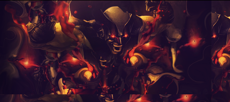
The right side of the sig looks cool
But the left side is too empty IMO.
The lightning source is too big.
And try to create some lightning at your render aswell.
Cause now I see a lightning source but I can't see what it does on the render
I don't like the red thing on the bottem left of the render.
That colour doesn't go with the others.
Effects on the right side are nice
I also like the blue colors.
Text is nice.
GJ but
Keep at it.


 Reply With Quote