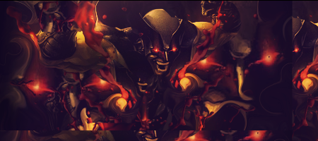
I think the colors doesn't match well.
The pink lightning between the 2 heads is too bright IMO.
Also the focal points needs some blending.
You can erase the sides from them a bit with a soft brush or so...
The text is pretty nice.
I can't really see what's going on between the guy and the girl.
There is something between them but I can't really see what it is.
Could be because of the bright lightning
Keep working at it


 Reply With Quote